@katiejolly6
on
It's getting hot in here: Looking at heat-related 311 reports in Boston homes
The past two weeks have been great, but so busy. I just started my classes for this semester and so far, so good (great, in fact!). I’ve also been applying for lots of summer programs. All of this has given me plenty of new material to write about! In particular, I worked on a presentation using 311 data in Boston and learned some new techniques that I think I’ll be using more in the future! Namely, I’d never used broom before for model output… and now I can’t imagine it any other way.
I was using highcharter to make interactive scatterplots and couldn’t find a great way of adding a line of best fit. Through Stack Overflow and Github issues, I learned that I could plot the line using the output from broom::augment. I also learned how to aggregate points to census tracts (i.e. how many data points lie in each tract) because I had only done that in ArcGIS. So many cool new things! In this post, I’ll be using ggplot2 instead. Still working through adding htmlwidgets to my posts…
Setting up the project
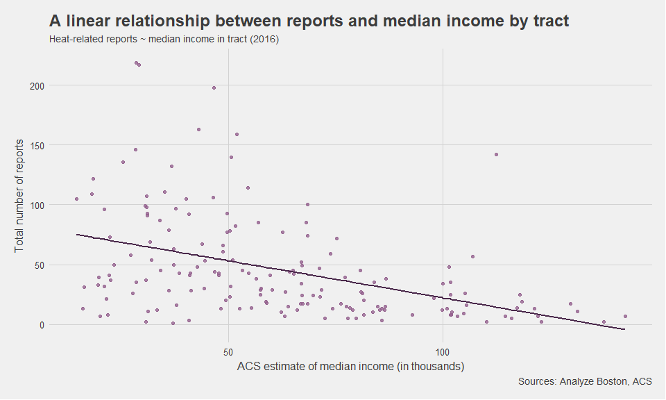
I specifically wanted to see and show that there is a negative relationship between the median income of a census tract and the total number of heat-related reports in that same tract. The idea here is that a lower income tract may have worse housing conditions and/or have more difficulty paying for heat during the cold Boston winters. There are some government programs that can help people pay for heat if they qualify, so I eventually wanted to present a list of where the city should advertise heating-assistance programs. First, I wanted to show why I was using certain variables in the selection. In particular I wanted to show that variables like income were in fact correlated with the number of heat-related reports in a given tract.
We will use a few different packages for this project, because each step is pretty independent of the others.
# packages

library(tidyverse) # reading and manipulating the data, and ggplot
library(tidycensus) # getting the income data
library(tigris) # shapefiles
library(broom) # lm output
library(sp) # manipulate spatial data
library(ggthemes) # make the plots look pretty
First, we need to read in the 311 data from Analyze Boston, which is a really great municipal database. The specific table I’m using can be found here or by searching 311 on the site. Downloading gives a CSV, and I’m pretty sure there’s an API as well.
data_311 <- read_csv("311.csv")
From this data, I only want to look at requests that either say Heat - Excessive Insufficient or Heat/Fuel Assistance.
heat_311 <- data_311 %>%
  filter(TYPE == "Heat - Excessive  Insufficient" | TYPE == "Heat/Fuel Assistance")
In total there are 7644 reports in our new table.
glimpse(heat_311)
## Observations: 7,644
## Variables: 29
## $ CASE_ENQUIRY_ID                <dbl> 101002327892, 101002327861, 101...
## $ open_dt                        <dttm> 2018-01-14 15:50:00, 2018-01-1...
## $ target_dt                      <dttm> 2018-02-13 15:50:32, 2018-02-1...
## $ closed_dt                      <dttm> NA, NA, NA, NA, NA, NA, NA, NA...
## $ OnTime_Status                  <chr> "ONTIME", "ONTIME", "ONTIME", "...
## $ CASE_STATUS                    <chr> "Open", "Open", "Open", "Open",...
## $ CLOSURE_REASON                 <chr> NA, NA, NA, NA, NA, NA, NA, NA,...
## $ CASE_TITLE                     <chr> "Heat - Excessive  Insufficient...
## $ SUBJECT                        <chr> "Inspectional Services", "Inspe...
## $ REASON                         <chr> "Housing", "Housing", "Housing"...
## $ TYPE                           <chr> "Heat - Excessive  Insufficient...
## $ QUEUE                          <chr> "ISD_Housing (INTERNAL)", "ISD_...
## $ Department                     <chr> "ISD", "ISD", "ISD", "ISD", "IS...
## $ SubmittedPhoto                 <chr> NA, NA, NA, NA, NA, NA, NA, NA,...
## $ ClosedPhoto                    <chr> NA, NA, NA, NA, NA, NA, NA, NA,...
## $ Location                       <chr> "2 Ayr Rd  Brighton  MA  02135"...
## $ Fire_district                  <int> 11, 9, 8, 4, 9, 6, 9, 12, 6, 9,...
## $ pwd_district                   <chr> "04", "10A", "07", "1C", "02", ...
## $ city_council_district          <int> 9, 7, 4, 2, 6, 2, 7, 5, 2, 7, 6...
## $ police_district                <chr> "D14", "B2", "B3", "D4", "E13",...
## $ neighborhood                   <chr> "Allston / Brighton", "Mission ...
## $ neighborhood_services_district <int> 15, 13, 9, 6, 11, 5, 13, 10, 5,...
## $ ward                           <chr> "Ward 21", "Ward 4", "Ward 18",...
## $ precinct                       <chr> "2114", "0409", "1802", "0801",...
## $ LOCATION_STREET_NAME           <chr> "2 Ayr Rd", "38 Annunciation Rd...
## $ LOCATION_ZIPCODE               <chr> "02135", "02120", "02126", "021...
## $ Latitude                       <dbl> 42.3371, 42.3352, 42.2791, 42.3...
## $ Longitude                      <dbl> -71.1487, -71.0919, -71.0891, -...
## $ Source                         <chr> "Constituent Call", "Constituen...
If you want to just use the heat data, I put it on my Github and you can use the raw csv from there.
Gathering demographic data
I love the tidycensus package for ACS data! I’m pretty familiar with the American FactFinder online interface but it gets old having to click all the boxes to get to the data. Instead, I can just put my search terms into the tidycensus::get_acs() function and have it appear as a tidy dataframe in RStudio! If you run this code, you’ll first need to register an API key.
bos_inc <- get_acs(geography = "tract", # get tract level data
              variables = c(medincome = "B19013_001"), # about median income
              state = "MA", # from Massachusetts
              county = "Suffolk") # in Suffolk County, where Boston is

# by default, the endyear in get_acs() is 2016, so we don't need to specify that
Next, we need to attach this income data to a spatial dataframe. We’ll get this data from the tigris package that draws from the TIGER/line shapefiles.
bos_tracts <- tigris::tracts( # get all the tracts
  state = "MA",
  county = "Suffolk") # from Suffolk County, Massachusetts
The tigris package also has the nice geo_join function for joining the acs data with the spatial data.
bos_joined <- tigris::geo_join(spatial_data = bos_tracts,
                       data_frame = bos_inc,
                       by = "GEOID")
Lat Long to Census Tract
In order to use sp::over() to aggregate the lat long points to the census tract level, we need the lat long points to be a SpatialPointsDataFrame.
# reverse geocoding: lat long to census tract
heat <- SpatialPointsDataFrame(coords=heat_311[, c("Longitude", "Latitude")], # identify the lat long variables
           data=heat_311[, c("neighborhood", "open_dt", "OnTime_Status", "CASE_STATUS", "LOCATION_STREET_NAME")], # identify the variables to keep
           proj4string=CRS("+proj=longlat +datum=WGS84")) # define the projection

heat <- spTransform(heat, "+proj=longlat +datum=NAD83 +no_defs +ellps=GRS80 +towgs84=0,0,0") # standardize the projection to match the acs data
heat_tract <- over(x=heat, y=bos_joined) # aggregate x to y

heat@data <- data.frame(heat@data, heat_tract) # combine data

heat_tracts <- heat@data # pull out only the data

# how many reports per census tract
heat_tracts_calc <- heat_tracts %>%
  group_by(GEOID) %>% # per tract
  summarize(total = n(), # how many reports?
            estimate = mean(estimate)/1000, # and what's the median income, in thousands? Mean is just a filler function here to return the median value
            moe = mean(moe)) # also a filler function. Could have used min or max also
Modeling a linear relationship
For simplicity, I’m assuming a linear relationship between total number of reports and median income, although in reality there is likely more nuance to the relationship. The response variable in this model will be the total number of reports.
tract_lm <- lm(total~estimate, data = heat_tracts_calc) # model reports by income

tidy_tract_lm <- tidy(tract_lm) # tidy it up

tidy_tract_lm # take a look at the coefficients
##          term   estimate std.error statistic      p.value
## 1 (Intercept) 83.9731968 6.8914239 12.185174 9.062715e-25
## 2    estimate -0.6176498 0.1001758 -6.165662 5.211590e-09
In fact, this model shows a statistically significant relationship between median income and total number of reports. On average, for each $1000 increase in median income, the number of reports decreases by 0.618. So we should expect more reports to be made in lower income neighborhoods, not accounting for other explanatory variables like accessibility, race, etc.
Visualizing the relationship
I’ll use broom::augment to calculate the fitted value for each tract based on the tract_lm model.
augmented_tracts <- augment(tract_lm) # calculate based on model

head(augmented_tracts) # look at the first 6 tracts. Fitted value are in the .fitted variable
##   .rownames total estimate  .fitted  .se.fit     .resid        .hat
## 1         1    24   69.818 40.85012 3.116875 -16.850122 0.006406271
## 2         2    27   80.932 33.98556 3.567607  -6.985562 0.008393067
## 3         3    17   66.875 42.66787 3.054871 -25.667866 0.006153929
## 4         4    38   86.773 30.37787 3.912173   7.622130 0.010092590
## 5         5     5   72.526 39.17753 3.196966 -34.177527 0.006739731
## 6         6    41   47.619 54.56133 3.334383 -13.561331 0.007331583
##     .sigma      .cooksd .std.resid
## 1 39.03809 0.0006074778 -0.4340922
## 2 39.05656 0.0001373349 -0.1801420
## 3 39.00863 0.0013534130 -0.6611706
## 4 39.05582 0.0001972890  0.1967263
## 5 38.96850 0.0026310817 -0.8806278
## 6 39.04594 0.0004511600 -0.3495292
ggplot() +
  geom_point(data = heat_tracts_calc, aes(x = estimate, y = total), color = "#94618E", alpha = 0.8) +
  geom_line(data = augmented_tracts, aes(x = estimate, y = .fitted), color = "#49274A", size = 1) +
  theme_fivethirtyeight()+
  labs(title = "A linear relationship between reports and median income by tract",
       subtitle = "Heat-related reports ~ median income in tract (2016)",
       y = "Total number of reports",
       x = "ACS estimate of median income (in thousands)",
       caption = "Sources: Analyze Boston, ACS") +
  theme(axis.title = element_text())
Thoughts and next steps
Of course, there are other variables that help explain the variance. One such variable might be the percent of homes that are renter-occupied (as opposed to owner-occupied). Another (important) angle to consider is the spatial nature of the data. I want to look at measures like spatial autocorrelation to have a better understanding of the distribution of 311 reports.
In one of my next posts, I’ll go through my site selection process for choose community centers/libraries/other public spaces in which Boston should advertise heating-assistance programs. I’d also love to hear your thoughts on other variables to look at or ways to improve my analysis. Thanks for reading!