@katiejolly6
on
Designing Map Cutouts with {sf} and {ggplot2}
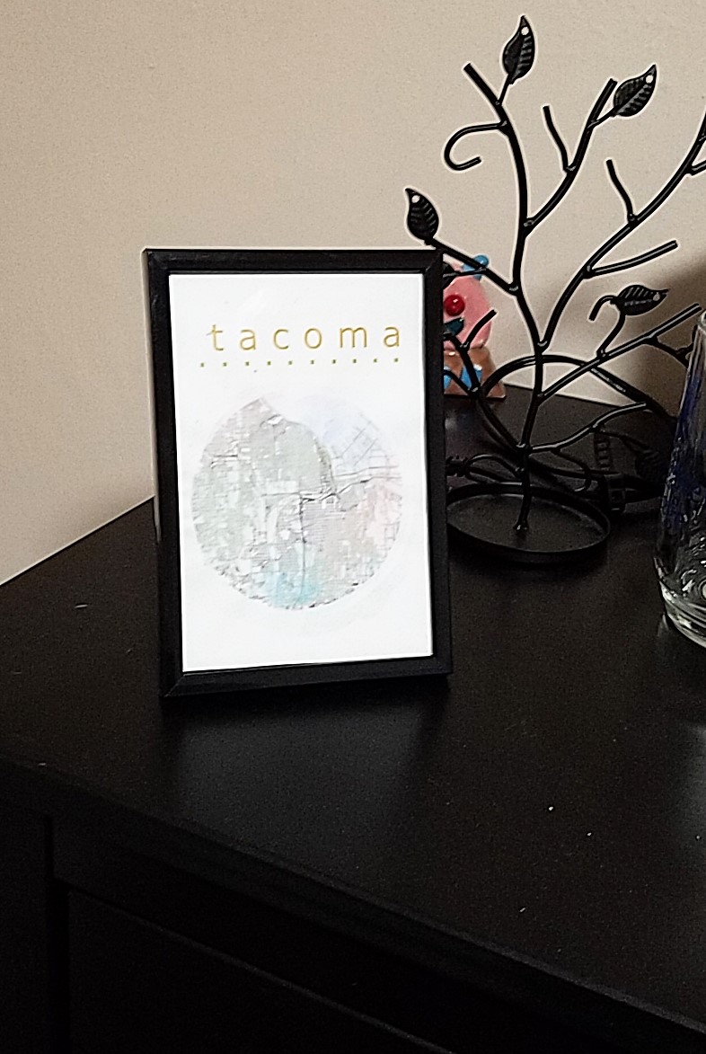
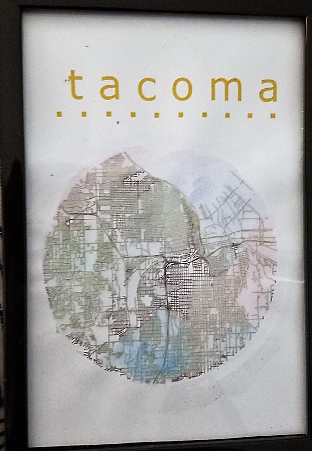
I wanted to make a nice map as a holiday present for a friend. The idea was that it would be a small circular map of the roads in Tacoma, Washington, her hometown. I generated as much as possible in R, but I also made use of Inkscape, a free alternative to Adobe Illustrator, and some watercolor paints. Inkscape was mostly for the text formatting and the watercolor was to fill in the white spaces. The map design was done only with a few lines of code! It was a great chance for me to practice some design techniques in R without being focused on doing any analysis since the result was purely visual.
Loading the data
I used tigris to get the roads and ArcGIS Open Data
Hub
to get the neighborhood boundaries. I then used sf to manipulate the
files and ggplot2 to visualize them.
# libraries used

library(tigris)
library(sf)
library(ggplot2)

options(tigris_class = "sf") # set sf as the default class for geographic data
I first loaded the roads for Pierce County, WA using tigris, since the
county level was the easiest. Since I set the options for tigris
above, the roads will be loaded as an sf dataframe instead of
SpatialPolygons. That becomes necessary later in order for it to work
nicely with the wrangling and visualizing code.
pierce_roads <- roads(state = "WA", county = "Pierce", year = 2017) %>%
  st_transform(26910) # use UTM 10N as the projection
The next step is to load the neighborhood boundary shapefile. I just used the neighborhood file because it was the first shapefile I found that covered all of Tacoma. The neighborhoods themselves aren’t important. The purpose of this data is to use it to crop the roads layer to just Tacoma instead of the entire county.
tacoma <- st_read("https://opendata.arcgis.com/datasets/94d4f87befd84ce5a0c2d3c542c4e219_1.geojson") %>%
  st_transform(26910) # same projection as above
Data wrangling
So now I have all the roads in Pierce County, but really I only care
about the roads actually in Tacoma. I can use st_crop to crop the
pierce_roads dataframe to the tacoma dataframe. I’ll crop it
specifically to the bounding box of Tacoma with st_bbox since
st_crop expects a rectangular shape.
tacoma_roads <- st_crop(pierce_roads, st_bbox(tacoma))
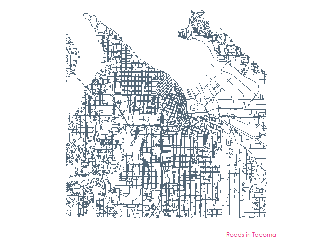
At this point we have a collection of the roads in Tacoma!
library(extrafont)

ggplot(tacoma_roads) +
  geom_sf(color = "#536777") +
  theme_void() +
  theme(panel.grid.major = element_line("transparent"),
        text = element_text(family = "Century Gothic", color = "#e83778")) +
  labs(caption = "Roads in Tacoma")
We could stop here, but I really wanted to have the roads in a circular cutout. I thought it would look sharp and I wanted to learn how to do it in R anyway. This seemed like a great cartography opportunity!
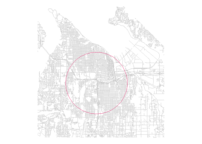
I decided that the best way was to crop the roads layer itself to a circle. I tried a few different methods and finally settled on one.
To draw the circle centered in the middle of the city I found the centroid of the entire roads shapefile and computed a buffer around it. I tried a variety of buffer distances before finding one that worked well.
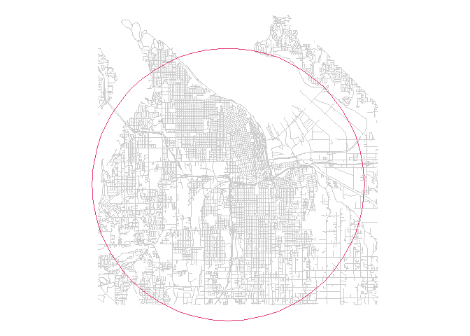
For example I tried buffer distances like 4,000 meters:
ggplot() +
  geom_sf(data = tacoma_roads, color = "gray80") +
  geom_sf(data = st_buffer(st_centroid(st_union(tacoma_roads)), 4000),
          color = "#e83778", fill = NA) +
  theme_void() +
  theme(panel.grid.major = element_line("transparent"))
- note: I used
st_union(tacoma_roads)because otherwise it calculates the centroid of each road segment.
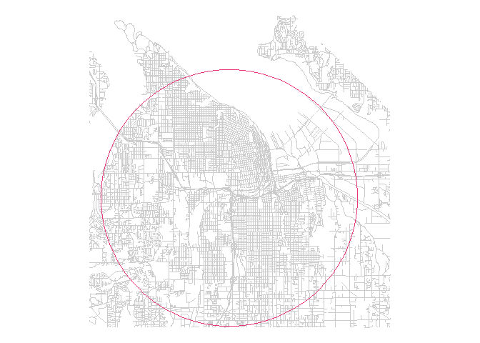
That was a bit too small, though. Next I tried 8,000:
ggplot() +
  geom_sf(data = tacoma_roads, color = "gray80") +
  geom_sf(data = st_buffer(st_centroid(st_union(tacoma_roads)), 8000),
          color = "#e83778", fill = NA) +
  theme_void() +
  theme(panel.grid.major = element_line("transparent"))
A bit of an overcorrection in my opinion, though. I wanted the bottom of the circle to be within the bounds of the roads.
I decided 7,000 was a happy medium:
ggplot() +
  geom_sf(data = tacoma_roads, color = "gray80") +
  geom_sf(data = st_buffer(st_centroid(st_union(tacoma_roads)), 7000),
          color = "#e83778", fill = NA) +
  theme_void() +
  theme(panel.grid.major = element_line("transparent"))
Then I saved just the roads in the circle with st_intersection(),
which finds the roads that overlap with the
buffer.
cropped_roads <- st_intersection(tacoma_roads, st_buffer(st_centroid(st_union(tacoma_roads)), 7000))
Designing the final visualization
At this point there isn’t much to do besides design work!
I first made the basic plot of the road cutout.
ggplot(cropped_roads) +
  geom_sf(color = "#515b72")  +
  theme_void() +
  theme(panel.grid.major = element_line("transparent"))
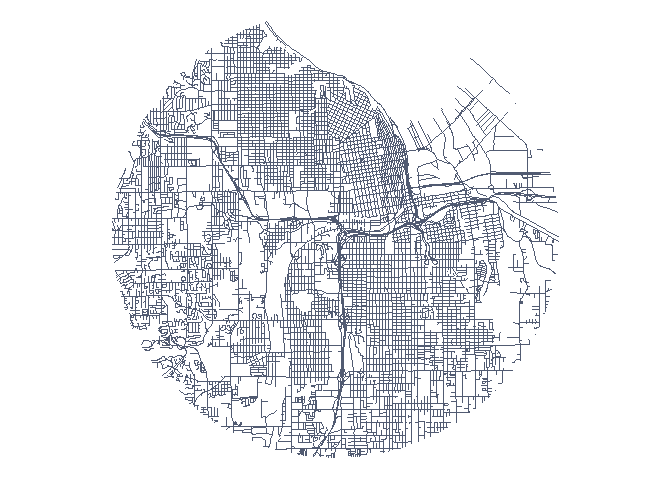
I then brought this image into Inkscape to have more flexibility with the text elements.
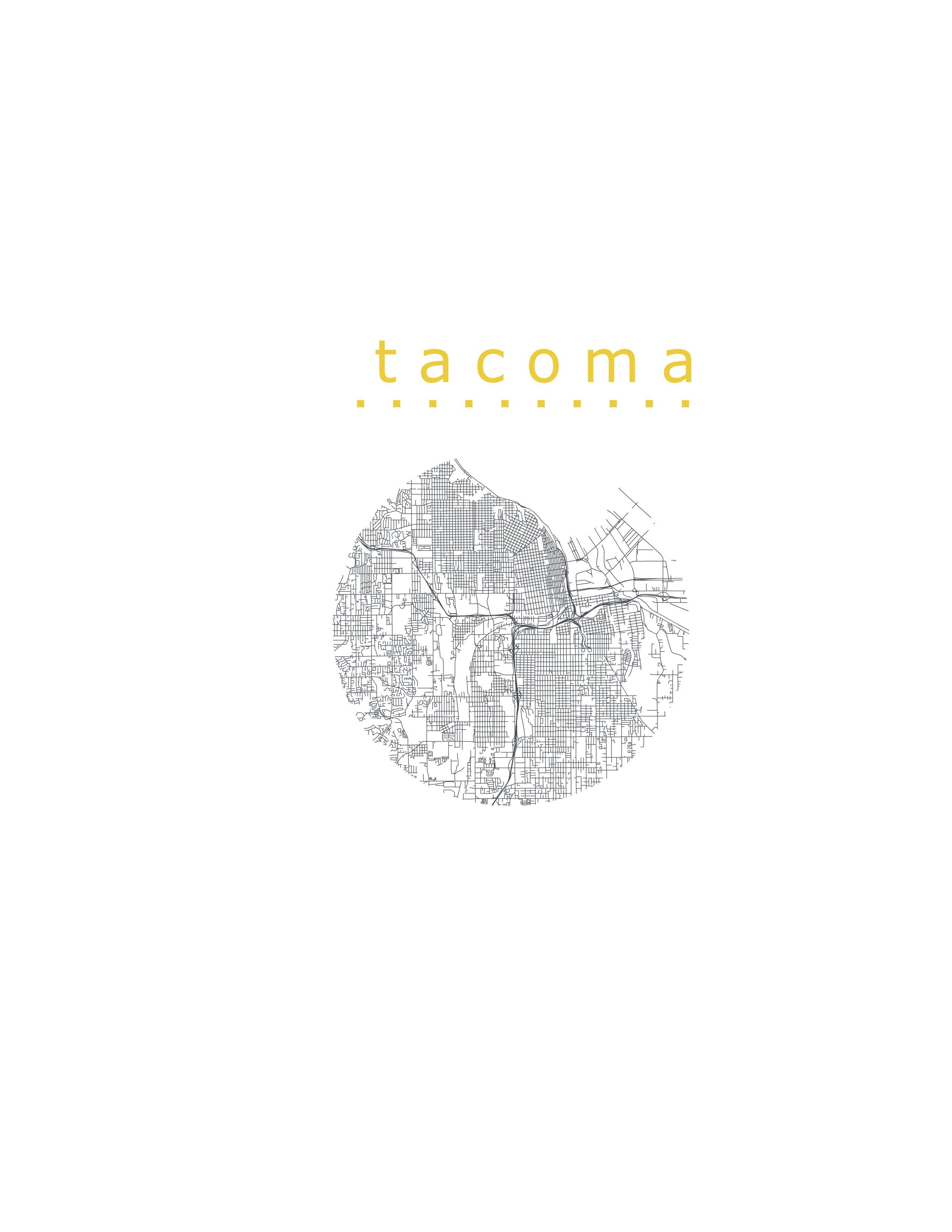
To create the final product I watercolored in the map part of the design. That step was pretty optional in my opinion. I’d also be curious to know if there’s a way to get a watercolor effect in R!