@katiejolly6
on
Making a GIF of Solar Panel Installations in Minnesota and Wisconsin
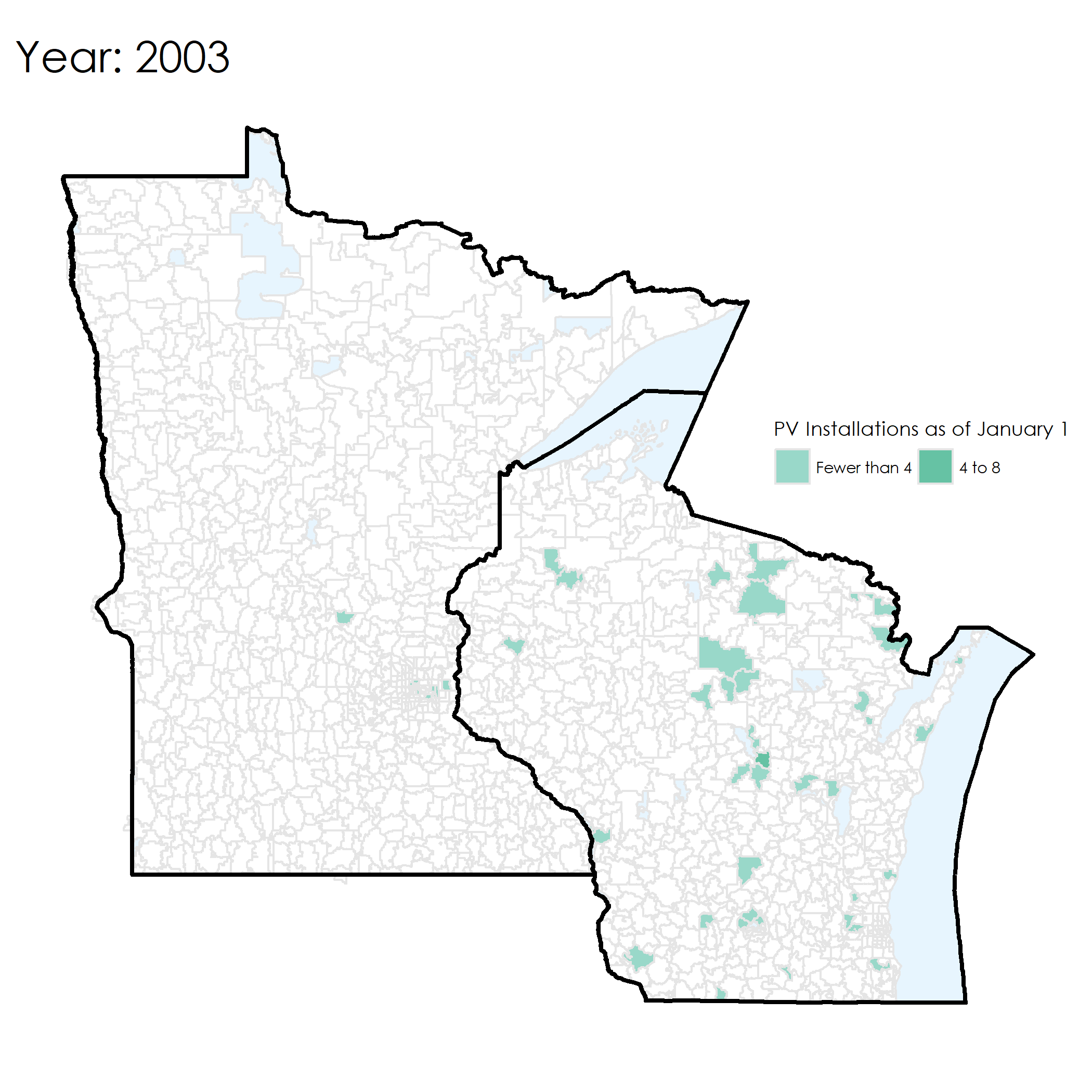
My friend Nadia has been working on her (amazing!) honors thesis in economics about solar energy in homes and peer effects. She wanted to make some maps of the number of homes with solar panels and an easier way to automate them. She essentially needed the same map for about 15 different years. In the end we also made a GIF showing all of the years sequentially! The data for this post were mostly collected from Open PV.
We decided to make them using R and we both learned lots of sf, magick and ggplot2 tricks in the process!
Gathering the data
We stored the data in a spreadsheet with one tab for each year to make looping through them easier in R. We started using the googlesheets package, but quickly came across rate limiting issues. In the end it was easy enough to use readxl instead!
The solar (PV) installation data is available through GitHub or directly from Google Drive. Please direct any issues with the links/data to me!
In order to read in all of the data, we decided to loop through the sheets and bind them together to create on big dataframe instead of having a smaller one for each year.
library(tidyverse)
library(readxl)
library(tigris)
library(sf)
library(janitor)
library(extrafont)
library(magick)
df_full <- tibble(year = as.numeric(),
                  zip = as.numeric(),
                  install = as.numeric(),
                  baselevel = as.numeric()) # initialize an empty dataframe so that we can loop through it later

for (i in 1:14){
  df <- read_excel("nmezicrealmap.xlsx", sheet = i) # each year is stored as a separate sheet in the workbook, we want to add them all together
  df_full <- bind_rows(df_full, df)
}

glimpse(df_full)
## Observations: 6,134
## Variables: 4
## $ year      <dbl> 2003, 2003, 2003, 2003, 2003, 2003, 2003, 2003, 2003...
## $ zip       <dbl> 53004, 53029, 53072, 53086, 53126, 53503, 53522, 535...
## $ install   <dbl> 2, 0, 2, 2, 2, 2, 1, 2, 0, 2, 1, 2, 1, NA, 2, 2, 2, ...
## $ baselevel <dbl> 0, 2, 0, 0, 0, 0, 0, 0, 2, 0, 1, 2, 0, 1, 2, 0, 0, 0...
The data was collected by zipcode so we need a basemap of zipcode boundaries in order to make some maps! Luckily the tigris package has amazing functions for gathering U.S. shapefiles. In this case we want a shapefile of zctas (zipcode tabulation areas).
options(tigris_use_cache = TRUE) # saves the results for later

zips <- zctas(cb = TRUE, year = 2010) %>% # get all zip code polygons
  st_as_sf() # convert to sf object
Not knowing much about how zipcodes are coded, we had a difficult time filtering out just zipcodes for Minnesota and Wisconsin (our two states of interest). We decided to scrape a table of all the zipcodes for MN and WI and filter using the %in% operator.
wi_zips <- read_csv("https://docs.google.com/spreadsheets/d/e/2PACX-1vSDf0obuIv1yF22kmN2OZ-w6POucJmB2QDNkUANph_YsvUCCuxzbyw2DZ1baf75R5-neMrlUS77cSVc/pub?output=csv") %>% # all the zipcodes in WI
  clean_names()

zips_wi_sf <- zips %>%
  filter(ZCTA5 %in% wi_zips$zip_code) # filter out just the Wisconsin zipcodes from the zipcodes sf dataframe
Just to make sure it actually looks like Wisconsin, we made a quick plot of the zipcode polygons.
ggplot(zips_wi_sf) +
  geom_sf() # plot to make sure it looks like Wisconsin
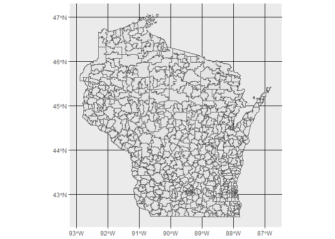
Sure enough, it does! We then repeated that process for Minnesota.
mn_zips <- read_csv("https://docs.google.com/spreadsheets/d/e/2PACX-1vT_ukd77dQc352AjSXvLk6RUZ7NyrDDWeA17WgnWwb_Rn7SusjT3H0Y_ADh1qDXo8TcJU8bYeCeTpb6/pub?output=csv") %>%
  clean_names()

mn_zips_sf <- zips %>%
  filter(ZCTA5 %in% mn_zips$zip_code) # same as above, but with MN zipcodes

ggplot(mn_zips_sf) +
  geom_sf() # make sure it looks like MN
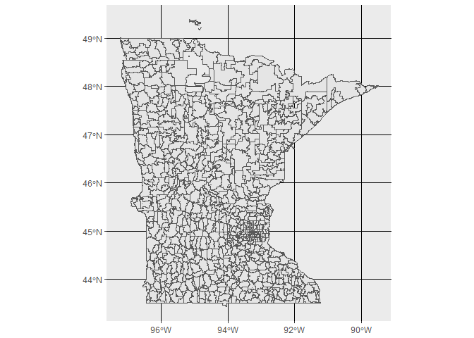
Beautiful! We next combined the two sf dataframes to make one that includes both MN and WI zipcodes.
As a sidenote, we had to troubleshoot the error we got when we tried to use dplyr::bind_rows(). We found this issue and this reference page and figured out by reading both of those that rbind was a better bet for non data frame objects (i.e. simple features objects).
zips_wi_mn <- rbind(mn_zips_sf, zips_wi_sf)
Preparing data for maps
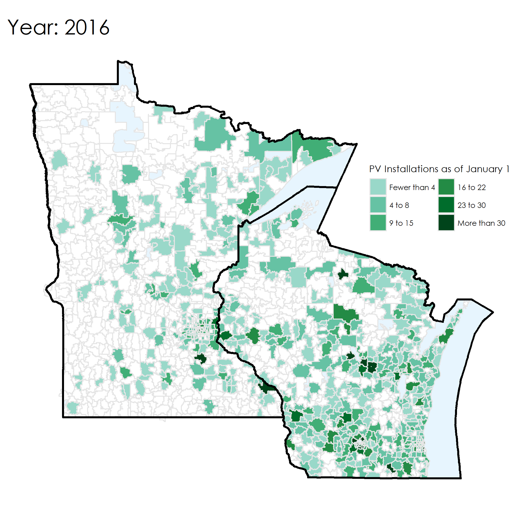
The baselevel numbers are stored as continuous values. Instead, we would prefer discrete categories so that the legends are more comparable over time. The same color values should represent the same baselevel values in each year in order to make quick visual comparisons.
In order to do this we can write some logic to group baselevel values into discrete categories using dplyr::case_when(). Nadia chose the categories, so I can’t speak much to the groupings.
df_full <- df_full %>%
  mutate(category = case_when(
    baselevel < 4 ~ "Fewer than 4",
    baselevel >=4 & baselevel < 9 ~ "4 to 8",
    baselevel >= 9 & baselevel < 16 ~ "9 to 15",
    baselevel >= 16 & baselevel < 23 ~ "16 to 22",
    baselevel >= 23 & baselevel < 31 ~ "23 to 30",
    baselevel >= 31 ~ "More than 30"
  )) # reassign cateogries based on the baselevel values so that we can map on a discrete color scale
We also need to join to the zipcode polygon layer. We’ll do a left join instead of a full join to include only the zipcodes for which we have observations.
full_data_sf <- df_full %>%
  mutate(zip = as.character(zip)) %>%
  left_join(zips_wi_mn, by = c("zip" = "ZCTA5")) # join with zipcodes
In order to get state boundaries to show up on the final maps, we can grab some outlines using tigris for MN and WI.
state_boundaries <- tigris::states() %>%
  st_as_sf() %>%
  filter(NAME %in% c("Minnesota", "Wisconsin")) # state boundary outlines
Making the maps!
After testing a few designs on single years, we wrote a function to automate that process.
The general process:
- Filter out a particular year
- Make a choropleth map of the
baselevelin each zip code that year - Make it look pretty (!!)
- Save it to the current working directory as “
year.pdf”
pal <- c("Fewer than 4" = "#99d8c9", "4 to 8" = "#66c2a4", "9 to 15" = "#41ae76", "16 to 22" = "#238b45", "23 to 30" = "#006d2c", "More than 30" = "#00441b") # create a named vector for the map legend and coloring. The names will be the text in the legend.

plot_data_map = function (yr) { # code from above in function form
  full_data_sf %>%
    filter(year == yr, !is.na(category)) %>%
    ggplot() +
    geom_sf(data = state_boundaries, fill = "lightskyblue", colour = "black", alpha = 0.2) +
    geom_sf(data = zips_wi_mn, colour = "gray90", fill = "white") +
    geom_sf(aes(fill = category), color = "gray90") +
    geom_sf(data = state_boundaries, fill = NA, colour = "black", size = 1) +
    ggtitle(paste0("Year: ", as.character(yr))) +
    ggthemes::theme_map() +
    scale_fill_manual(values = pal,
                      breaks = c("Fewer than 4", "4 to 8", "9 to 15", "16 to 22", "23 to 30", "More than 30"),
                      guide = guide_legend(title = "PV Installations as of January 1", ncol = 2, family = "Century Gothic")) +
    theme(panel.grid.major = element_line(colour = "white"),
          legend.position = c(.70, .57),
          plot.title = element_text(size=20, family = "Century Gothic"),
          legend.text = element_text(family = "Century Gothic"),
          legend.title = element_text(family = "Century Gothic"))
  name <- as.character(yr)
  ggsave(paste0(name, ".png")) # save each map as year.pdf in the current working directory
}
Then we used lapply to loop over each of the years.
plots <- lapply(2003:2016, plot_data_map) # loop over each year
Here’s an example of the map from 2016. It shows the number of existing installations as of 1 January 2016.
Animation!
Now that we have all of the plots created (one per year), we can paste them all together in a GIF! I’ll use ROpenSci’s awesome magick package for image processing.
To create the GIF, I followed the guide of Ryan Peek’s post “Animated gif maps in R”.
list.files(path = ".", pattern = "*.png", full.names = T) %>%
  map(image_read) %>% # reads each path file
  image_join() %>% # joins image
  image_animate(fps=1) %>% # animates, can opt for number of loops
  image_write("pv_installation.gif") # write to current dir