@katiejolly6
on
Spatial clustering of personal belief exemptions for vaccines in California
I’m someone who learned GIS by using ArcGIS. As I became more comfortable with R, Python, and QGIS, though, I was frustrated by how inaccessible ESRI products are to many people. Plus as the open source options grow and improve there is less of a tangible difference between the options. Now, in many ways, I find R easier to use for GIS questions (many thanks to R Spatial for their introductory materials).
This post comes from a much longer project that will eventually become a conference presentation. I’m building spatial lag models to describe patterns of personal belief exemptions (PBEs) for vaccines in California. The exemptions are no longer allowed (in their broadest form), but the implications in California have been clear and long-standing. Schools that no longer had herd immunity for children with medical exemptions were risky places for disease spreading. The measles outbreak in 2014 that originated in Disney Land was likely furthered by low herd immunity in some K-12 schools as a result of high numbers of students with exemptions.
When I started working with the data, someone asked me why I couldn’t just run an OLS regression with my explanatory variables (race, education, income, etc.) to model PBE rates across the state. Quickly I found myself on a long spatial autocorrelation tangent. Essentially, data is that spatially autocorrelated violates the assumptions of OLS regression and can give very misleading output. This post will focus on that part of the problem: why we can’t use OLS regression. A later post will focus on the spatial lag models.
Let’s start!
I’m using a variety of packages for this project.
library(tidyverse)
library(ggthemes)
library(hexbin)
library(fiftystater) # get California outline
library(sp) # transformations
library(rgdal)
library(spdep) # spatial calculations
library(janitor) # clean the variable names
The data are available through the California Department of Education as well as on my github page.
# data

common_crs <- CRS("+proj=aea +lat_1=34 +lat_2=40.5 +lat_0=0 +lon_0=-120 +x_0=0 +y_0=-4000000 +datum=NAD83 +units=m +ellps=GRS80 +towgs84=0,0,0") # teale albers

schools_shp <- readOGR("C:\\Users\\katie\\Documents\\healthGIS_spatial_lag_modeling\\california_schools_pbe\\CA_schools_PBE.shp") %>%
  spTransform(common_crs)

schools_data <- schools_shp %>%
  as_tibble() %>%
  clean_names() # pull out the data for some plotting
Simple visualization of rates
First I wanted to make a point map that shows magnitudes through the size of the point. I’ve seen this data before so I had a good idea of what it should look like, but wanted to check my assumptions.
schools_data <- schools_data %>%
  mutate(pbe_rate = (pbetot / enrolltot) * 100)

california_outline <- fifty_states %>%
  filter(id == "california")
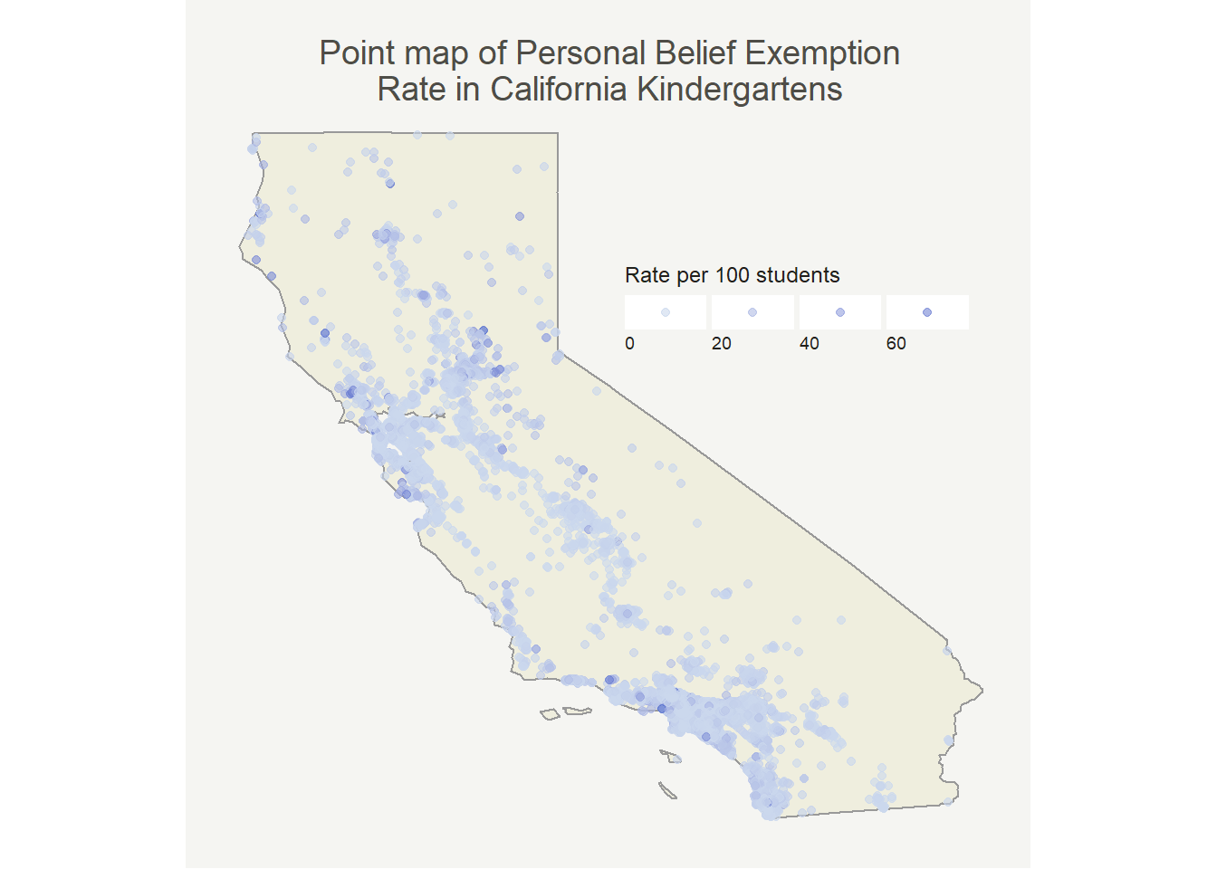
So, most places have pretty low rates which isn’t all that surprising. It’s well documented that only a few schools have high rates. At first glance we can already see that it looks like there’s at least some degree of positive autocorrelation (similar values are near one another). Now that I see this pattern I want to have a better way of quantifying it to justify my dismissal of OLS regression.
Before that though, to take care of some of the problem of overlapping points that obscure the image I binned the observations in a hexbin map. Each hexagon is the mean of the PBE rates included in that area. The map with medians looked very similar.
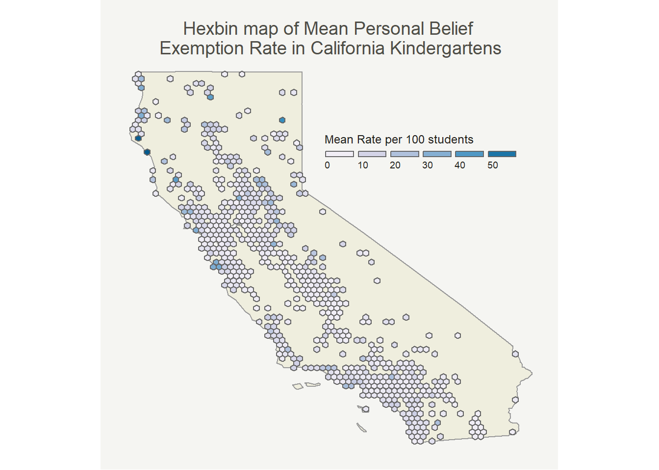
The pattern here looks very similar to the point map (as it should). I mostly made it because I thought it would be cool!
Now that we can see a (pretty) clear visual pattern, we can quantify that pattern with Moran’s I.
Quantifying the clusters
The actual equation for Moran’s I(ndex of spatial autocorrelation) is similar to computing the correlation coefficient, just with the added bonus of a spatial weights matrix. Negative indices (relatively rare) mean that similar values are far from each other, zero means that values are random distribution across your study area, and positive indices mean that similar values are near one another.
To measure proximity, I’m going to use a k-nearest neighbors approach. Another approach to try next time would be d-nearest neighbors (based on a maximum distance). There are also other techniques, such as inverse distance weighting (IDW). Perhaps another blog post in the future can explain the intricacies and differences between the methods!
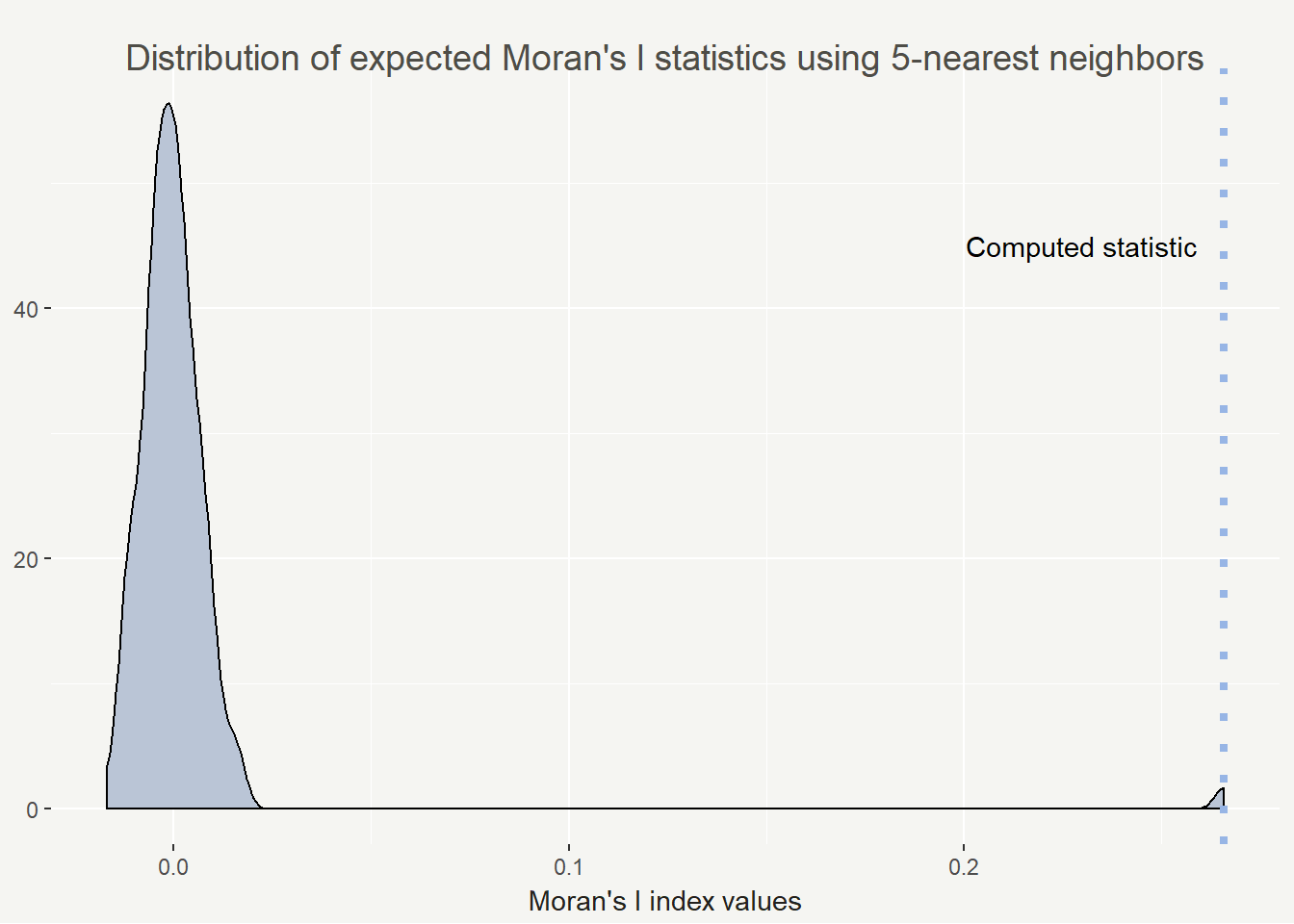
The more robust version of Moran’s I is uses Monte Carlo method, which is the version I used here. I’ll illustrate the distribution and where our statistic fell on the simulated distribution.
schools_shp$pbe_rate <- schools_shp$PBETot / schools_shp$EnrollTot # calculate the pbe rates per school

schools_knn <- knearneigh(schools_shp, k = 5) # neighborhood size 5

schools_nb <- knn2nb(schools_knn) # convert to nb object from knn

ww <- nb2listw(schools_nb, style = "B") # makes a weights matrix

mc_points <- moran.mc(schools_shp$pbe_rate, ww, nsim = 99) # simulate 99 + 1 times
mc_points # summary of the results
##
##  Monte-Carlo simulation of Moran I
##
## data:  schools_shp$pbe_rate
## weights: ww
## number of simulations + 1: 100
##
## statistic = 0.26572, observed rank = 100, p-value = 0.01
## alternative hypothesis: greater
So we are seeing an statistically significant index value of 0.26572. Possible values range from -1 to 1 and in practice, 0.26 is actually a fairly high value. I feel comfortable saying we are seeing positive spatial autocorrelation in personal belief exemption rates in California.
I’m a very visual learner and I love having statistics drawn out. I find a density plot helpful for visualizing the results of Monte Carlo Moran’s I. It’s also easy to plot with base R plotting (but why not use ggplot2 if I can).
This all being said, the Moran’s I index can vary widely based on your conceptualization and definition of spatial relationships. To that end I calculated the Moran’s I statistic for 1 to 20 neighbors to show how the value changes. In this case it decreases but that isn’t always the case.
moran_knn_schools <- function(k = 5, nsim = 99) {
  knn <- knearneigh(schools_shp, k = k)
  nb <- knn2nb(knn)
  ww <- nb2listw(nb, style = "B")
  moran <- moran.mc(schools_shp$pbe_rate, ww, nsim = nsim)
}

stats <- c()
p <- c()

for (k in 1:20) {
  knn <- moran_knn_schools(k = k)
  stats <- c(stats, knn$statistic)
  p <- c(p, knn$p.value)
}
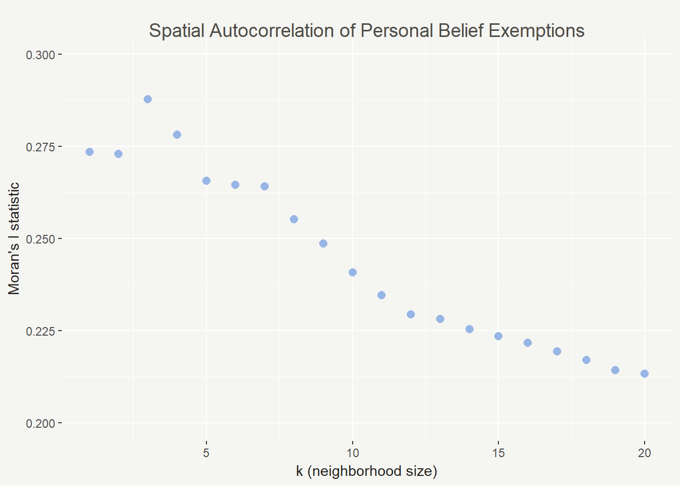
In this case we see the highest spatial autocorrelation with 3 neighbors and the lowest with 20. It’s a good sign that they are all positive, though (and not too close to zero). As k increases, spatial autocorrelation should eventually flatten out because we will lose the nuance in the patterns.
LISA statistic
A global Moran’s I statistic is not the only way we can quantify spatial autocorrelation, though. It might also be interesting to know where clusters of particular values are in space. The Local Indicators of Spatial Autocorrelation (LISA) calculation is what we will use here.
local_moran <- localmoran(schools_shp$pbe_rate, ww) # same spatial weights matrix as above

schools_shp$s_pbe_rate <- scale(schools_shp$pbe_rate) %>% as.vector() # create a variable based on pbe rates with mean = 0 and sd = 1

schools_shp$lag_s_pbe_rate <- lag.listw(ww, schools_shp$s_pbe_rate) # create a spatially lagged variable for pbe rate
Now that we’ve calculated values for each point, we need to classify the cluster type.
- High-high: statistically significant high value in an area of high values
- High-low: statistically significant high value in an area of low values
- Low-high: statistically significant low value in an area of high values
- Low-low: statistically significant low value in an area of low values
schools_shp@data <- schools_shp@data %>%
  mutate(quad_sig = case_when(
    schools_shp$s_pbe_rate >= 0 & schools_shp$lag_s_pbe_rate >= 0 & local_moran[, 5] <= 0.05 ~ "high-high",
    schools_shp$s_pbe_rate <= 0 & schools_shp$lag_s_pbe_rate <= 0 & local_moran[, 5] <= 0.05 ~ "low-low",
    schools_shp$s_pbe_rate >= 0 & schools_shp$lag_s_pbe_rate <= 0 & local_moran[, 5] <= 0.05 ~ "high-low",
    schools_shp$s_pbe_rate <= 0 & schools_shp$lag_s_pbe_rate >= 0 & local_moran[, 5] <= 0.05 ~ "low-high",
    local_moran[, 5] > 0.05 ~ "not signif."
  )) # classify the cluster types
In this case, the only cluster type is high-high due to lack of statistical significance for other clusters.
Map the clusters
Now we can put the clusters on the map! I’ll highlight the high-high clusters in red and mark the other points in light gray.
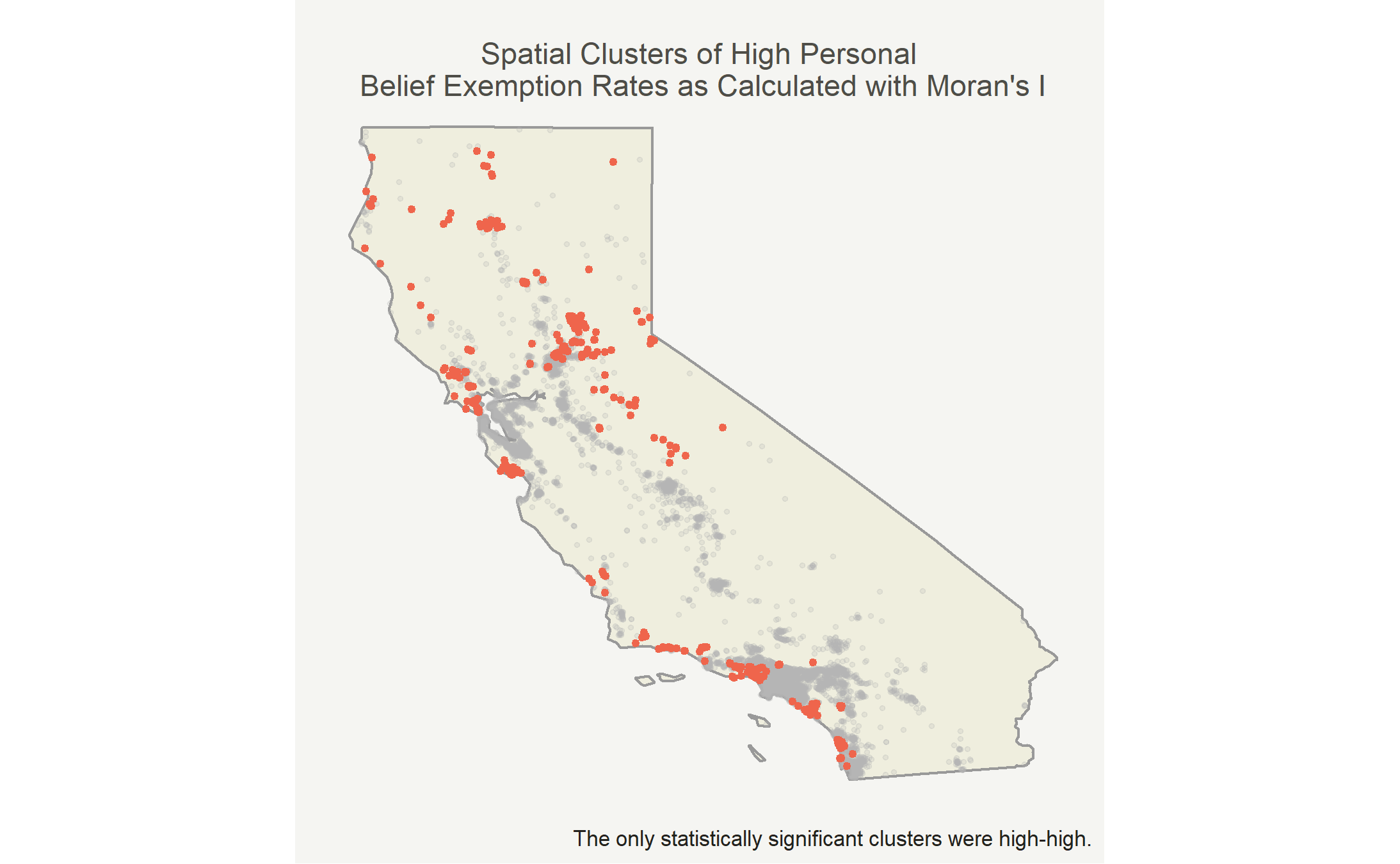
| cluster | sd | mean | skew |
|---|---|---|---|
| high-high | 0.1520802 | 0.1935512 | 1.848029 |
| not signif. | 0.0406840 | 0.0243241 | 5.876187 |
The mean personal belief rate in high-high clusters was 19.4% while the mean personal belief rate elsewhere was 2.4%. There was generally larger spread in the high-high clusters, because certain observations were extremely high. Both groups are right skewed, but the insignificant clusters were more right skewed.
Conclusions and next steps
Knowing now that there are high-high clusters of personal belief exemptions rates in California I’m interested in why those clusters exist. To answer that questions I’ll use spatial lag models with compositional and contextual factors about communitites and places as explanatory variables. Some might include political lean, race, income, education, and foreign-born populations.
Clusters can also be analyzed at different geographic scales, especially for modeling. The most precise, while still being fairly accurate, data available is typically at the census tract level. To use this data I’ll aggregate the schools to the census tract, but I expect to find similar clustering patterns.