@katiejolly6
on
Data-driven design in 'Curious City: In, Out, Above, Beyond Saint Paul'
Data-driven design & inspiration
I’ve recently become more interested in the artistic side of data visualization and cartography. Data-driven design is also sometimes called information design. In this post I’ll talk about how I used both R and design software to create a spread called “Turning the Page” for the book Curious City: In, Out, Above, Beyond Saint Paul.
This past semester I signed up for a class in Macalester’s geography department called “Cultural Atlas Production.” I wasn’t really sure what a cultural atlas was at the time, though. In the first few meetings of the class we focused on studying the existing exemplar atlases. Some of these were Infinite City, Unfathomable City, and Nonstop Metropolis all by Rebecca Solnit and Portlandness by David Banis and Hunter Shobe. I was drawn to the Cheshire and Oliver’s atlas London: The Information Capital because of how data-driven their spreads were. In particular, one spread that I found myself coming back to over and over was “All the Tate’s Treasures.”
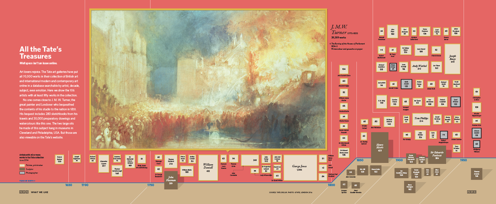
I loved how Cheshire and Uberti captured so much information in the graphic. From the visual cues to tell readers that the piece is about art galleries to the amount of data captured by the individual glyphs, the whole piece is stunning. I was really curious about the process to create this piece so I started doing some research. I figured out pretty quickly that James Cheshire is an R user, so I assumed that the underlying graphics were created from something like ggplot2. Lucky for me, I found the website for the atlas.
On the site, there was actually an article called The Coder and the Designer detailing exactly the process I was interested in: creating graphics in ggplot2 and then editing them to be production-quality designs. The article included some examples of before and after (the design phase) images. It included the before and after of the Tate spread, as well as a few of the other data-driven ones.
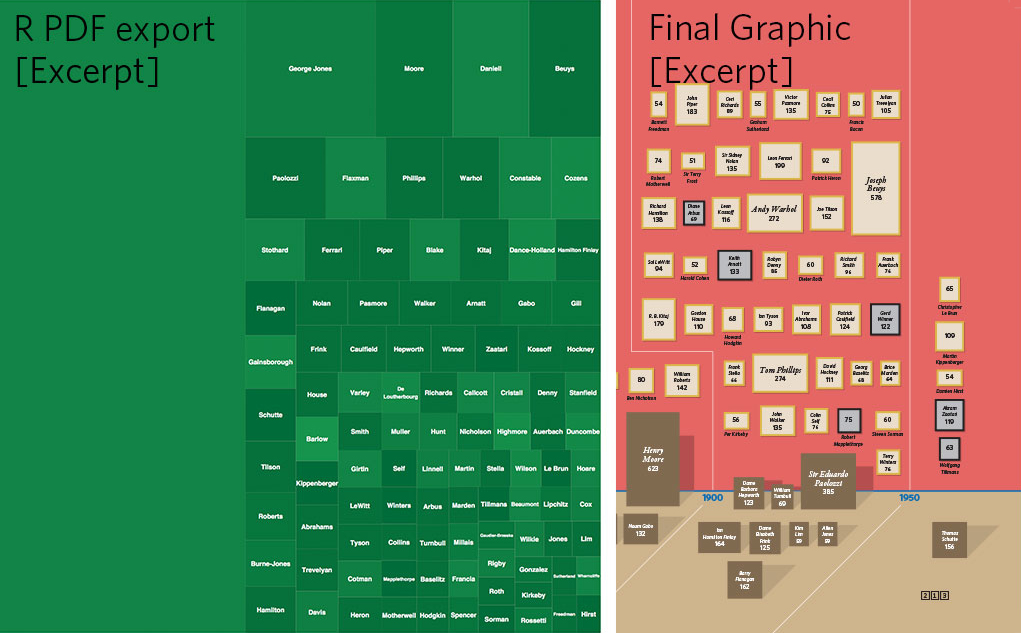
Image: All the Tate’s Treasures
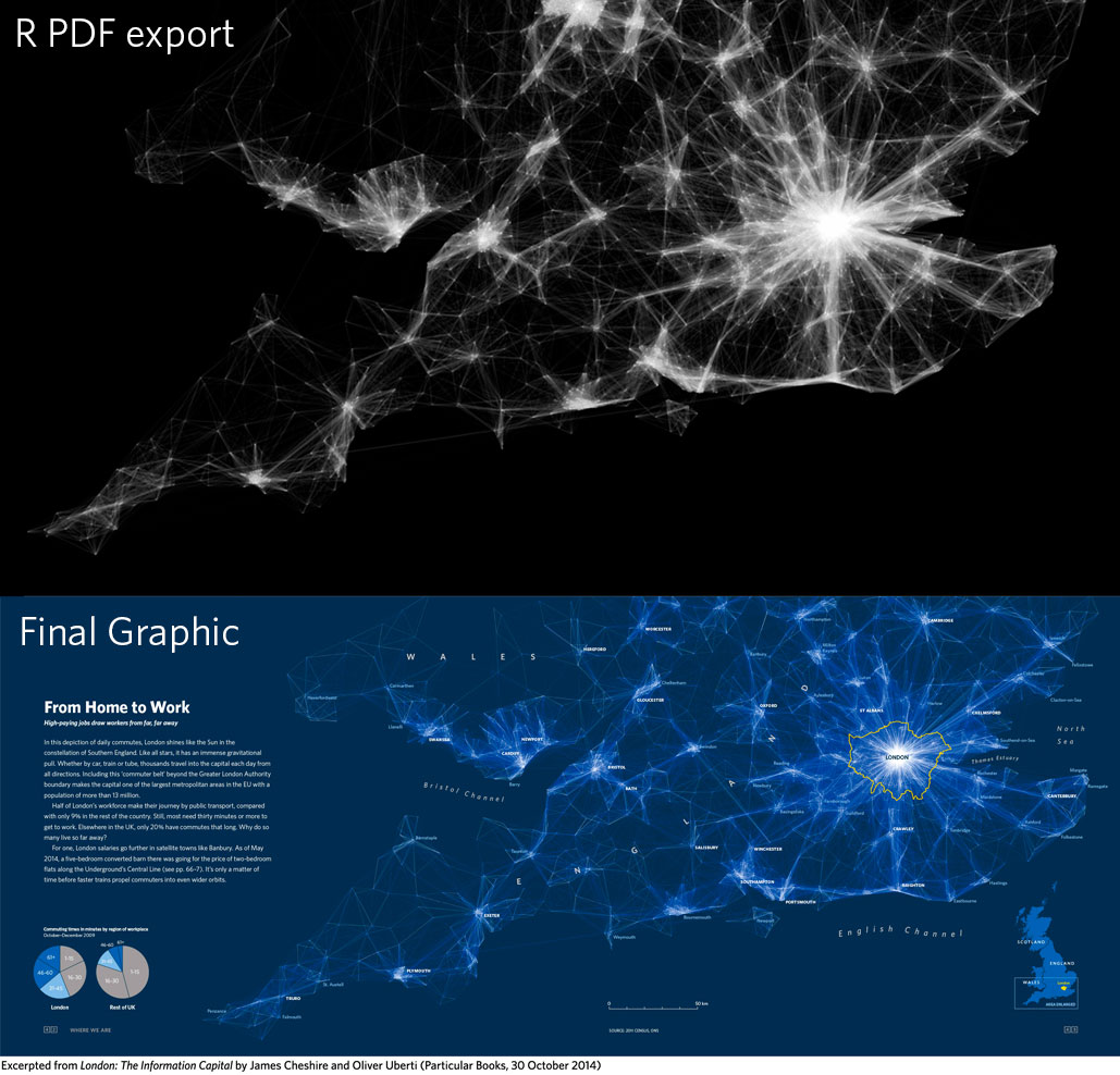
Image: From Home to Work

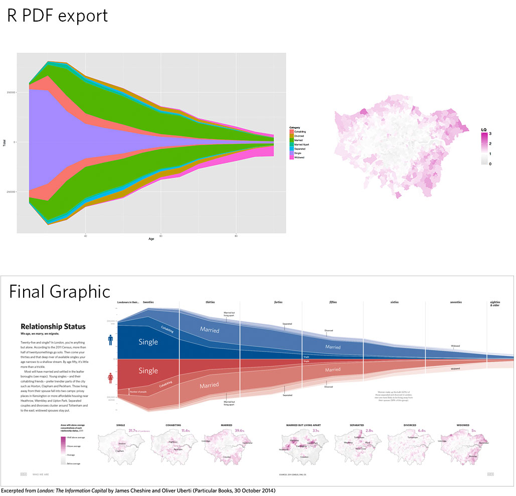
Image: Relationship Status
Coming up with my own design
In the first week of the class we had to write down a few key things we wanted to learn from the class. I knew that I wanted to learn more about the book publishing process, combining code and design, and narrative structure in designs (a lot to learn in not that much time). Of those, the one I was most excited about was combining code and design. In my mind that was mostly the process of refining the graphics produced by ggplot2 (or some other code-based plotting package).
I was thinking about how I liked the Tate spread so much and how I could create something in the same vein. I thought about museums with significant collections in Saint Paul, but Minneapolis institutions came to mind more. So I started thinking more broadly about “collections” and immediately thought of libraries. I thought about how many directions I could go with a spread about public libraries and knew pretty quickly that that was the direction I was going to take. Some of my other ideas were street orientations in different neighborhoods (and how things like highways would affect these patterns) and generating color schemes from different iconic views across the city. Neither of those made me as excited, though.
At this point I did background research about public libraries and started to think about where I might get data. I also did some field visits to different libraries across the city.
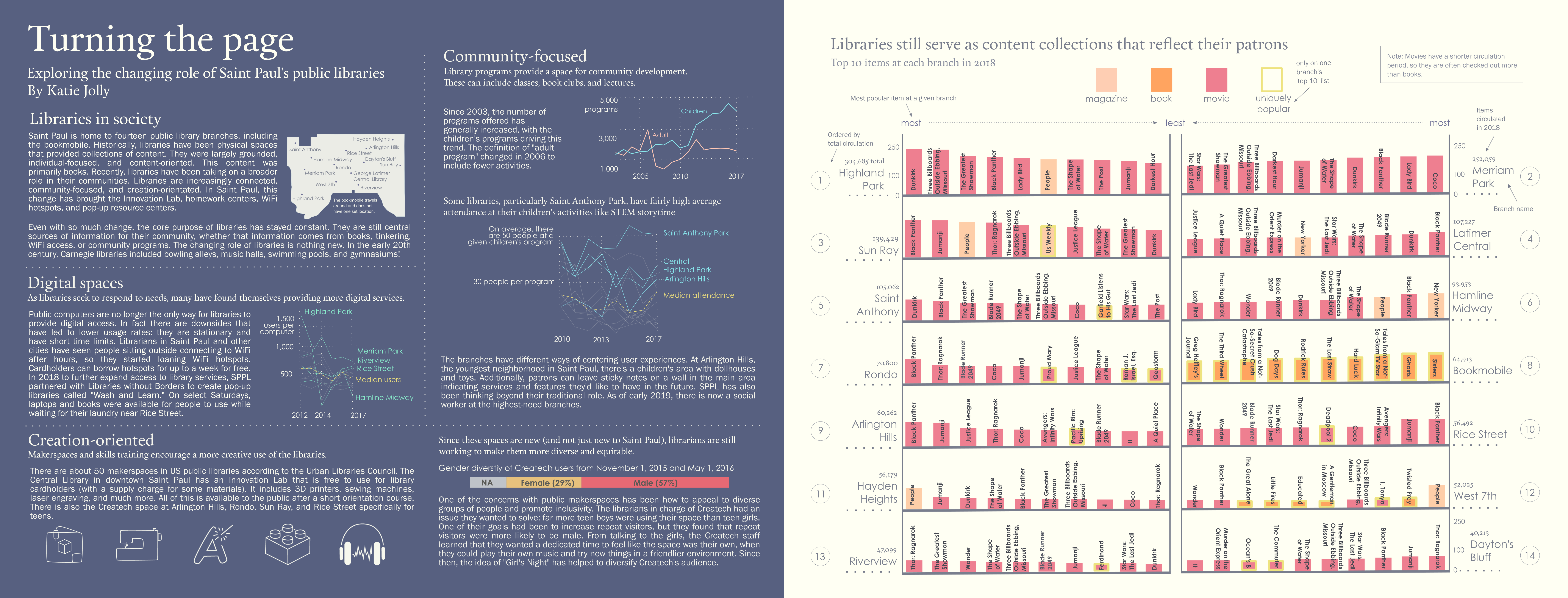
I found a blog post from the library about the most popular items overall in 2018. This got me thinking that a visualization at the branch level could be an interesting direction. I contacted the author of the post who then put me in touch with the circulation staff. They were so kind and helpful and sent me the top 50 titles for each branch in 2018, as well as some supplementary data such as total circulation. I also collected data on branch-level statistics from the Minnesota Department of Education. In this post I’ll only discuss my process for visualizing the circulation data, though.
Data wrangling
If you’d like to reproduce this section, the data is available at this link. The files for each individual branch are also available in the same repository.
# use this code to read in all the data
library(tidyverse)
data <- read_csv("https://raw.githubusercontent.com/katiejolly/stp-cultural-atlas/master/data/Popular_Titles.csv")
I got the data as one spreadsheet for each branch. So first I read each file into R individually (intentionally not in a batch process). This allowed me to add a column for the branch name.
library(readxl)

Popular_Titles_Highland_Park <- read_excel("data/Popular_Titles Highland Park.xlsx",
     skip = 2) %>%
     mutate(Library = "Highland Park")

Popular_Titles_Merriam <- read_excel("data/Popular_Titles Merriam.xlsx",
     skip = 2) %>%
     mutate(Library = "Merriam")

Popular_Titles_Rondo <- read_excel("data/Popular_Titles Rondo.xlsx",
     skip = 2) %>%
     mutate(Library = "Rondo")

Popular_Titles_St_Anthony <- read_excel("data/Popular_Titles St. Anthony Park.xlsx",
     skip = 2) %>%
     mutate(Library = "St. Anthony Park")

Popular_Titles_Riverview <- read_excel("data/Popular_Titles Riverview.xlsx",
     skip = 2) %>%
     mutate(Library = "Riverview")

Popular_Titles_Rice_Street <- read_excel("data/Popular_Titles Rice Street.xlsx",
     skip = 2) %>%
     mutate(Library = "Rice Street")

Popular_Titles_Hayden_Heights <- read_excel("data/Popular_Titles Hayden Heights.xlsx",
     skip = 2) %>%
     mutate(Library = "Hayden Heights")

Popular_Titles_Arlingon <- read_excel("data/Popular_Titles Arlington.xlsx",
     skip = 2) %>%
     mutate(Library = "Arlington")

Popular_Titles_Hamline <- read_excel("data/Popular_Titles Hamline.xlsx",
     skip = 2) %>%
     mutate(Library = "Hamline")

Popular_Titles_Daytons_Bluff <- read_excel("data/Popular_Titles Dayton's Bluff.xlsx",
     skip = 2) %>%
     mutate(Library = "Dayton's Bluff")

Popular_Titles_Central <- read_excel("data/Popular_Titles Central.xlsx",
     skip = 2) %>%
     mutate(Library = "Central")

Popular_Titles_Bookmobile <- read_excel("data/Popular_Titles Bookmobile.xlsx",
     skip = 2) %>%
     mutate(Library = "Bookmobile")

Popular_Titles_West7th <- read_excel("data/Popular_Titles West 7th.xlsx",
     skip = 2) %>%
     mutate(Library = "West 7th")

Popular_Titles_Sun_Ray <- read_excel("data/Popular_Titles Sun Ray.xlsx",
     skip = 2) %>%
     mutate(Library = "Sun Ray")
After all the data was read in, I joined it into one large table of every branch’s top 50 items.
There’s probably a much prettier way to do this. If you know how to do this step a bit better, I’d love to know what you think!
dfs = sapply(.GlobalEnv, is.data.frame)
dfs

Popular_Titles <- do.call(bind_rows, mget(names(dfs)[dfs]))
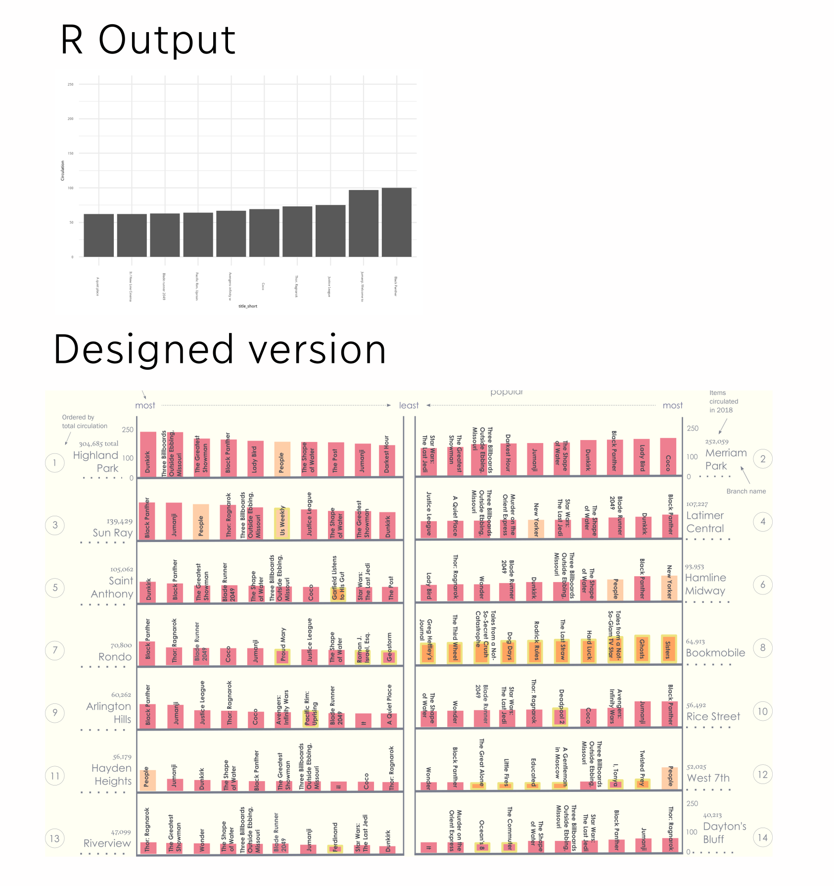
Generating the underlying plots
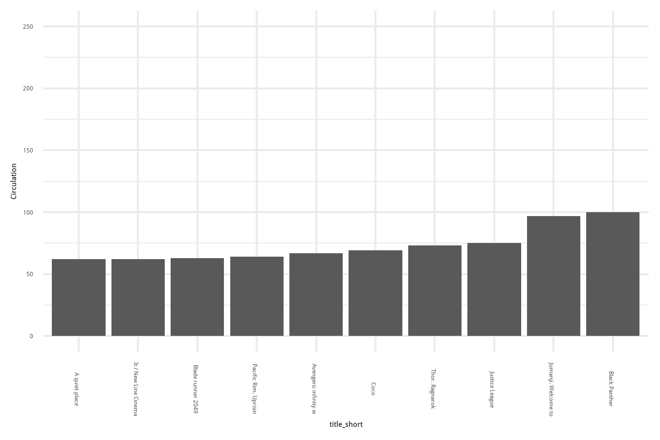
Once I had my data in R (and did some exploratory plots), it was time to make the plots for my design! I set up a framework where I had one function for the right-hand side of the plot and the left-hand side because the ordering of the bars needed to be opposite. I also decided to only visualize the top 10 items at a branch for the sake of space.
make_title_svg_right <- function(data, file){
  g <- data %>%
  mutate(title_short = substr(Title, start = 1, stop = 21)) %>% # make sure the title isn't too long
  mutate(title_short = fct_reorder(title_short, Circulation)) %>%
  arrange(desc(Circulation)) %>%
  head(10) %>% # just the top 10 items at a branch
  ggplot(aes(x = title_short, y = Circulation)) +
  geom_col() +
  theme_minimal() +
  theme(text = element_text(family = "Century Gothic"), axis.text.x = element_text(angle = -90),
        panel.grid = element_line("transparent")) +
  ylim(0, 250) +
  ggtitle(file) + # make the title the same as the filename so it's easy to keep track of
  geom_text(aes(y = Circulation + 15, label = Circulation))

  ggsave(file, g, width = 4.5, height = 3) # save to a file, ideally an svg
}

make_title_svg_left <- function(data, file){
  g <- data %>%
  mutate(title_short = substr(Title, start = 1, stop = 21)) %>%
  mutate(title_short = fct_reorder(title_short, -Circulation)) %>%
  arrange(desc(Circulation)) %>%
  head(10) %>%
  ggplot(aes(x = title_short, y = Circulation)) +
  geom_col() +
  theme_minimal() +
  theme(text = element_text(family = "Century Gothic"), axis.text.x = element_text(angle = 90),
        panel.grid = element_line("transparent")) +
  ylim(0, 250) +
  ggtitle(file) +
  geom_text(aes(y = Circulation + 15, label = Circulation))

  ggsave(file, g, width = 4.5, height = 3)
}
This process created a plot like the one below for each branch (fourteen total):
# make a plot for each library
make_title_svg_right(Popular_Titles_Bookmobile, "plots/bookmobile_bar.svg")
make_title_svg_right(Popular_Titles_Central, "plots/central_bar.svg")
make_title_svg_right(Popular_Titles_Highland_Park, "plots/highland_bar.svg")
make_title_svg_right(Popular_Titles_Riverview, "plots/riverview_bar.svg")
make_title_svg_right(Popular_Titles_Daytons_Bluff, "plots/daytons_bluff_bar.svg")
make_title_svg_right(Popular_Titles_Hamline, "plots/hamline_bar.svg")


make_title_svg_left(Popular_Titles_Sun_Ray, "plots/sun_ray_bar.svg")
make_title_svg_left(Popular_Titles_West7th, "plots/west_7th_bar.svg")
make_title_svg_left(Popular_Titles_Rice_Street, "plots/rice_st_bar.svg")
make_title_svg_left(Popular_Titles_Rondo, "plots/rondo_bar.svg")
make_title_svg_left(Popular_Titles_Hayden_Heights, "plots/hayden_heights_bar.svg")
make_title_svg_left(Popular_Titles_Merriam, "plots/merriam_park_bar.svg")
make_title_svg_left(Popular_Titles_St_Anthony, "plots/st_anthony_bar.svg")
In the end I actually ended up switching the side of a lot of these branches so my planning wasn’t that useful… but the lesson from that is that I’ll plan better next time!
Designing the final layout
Since I saved each plot individually as an svg, it was fairly easy to pull them apart to just keep the parts I wanted. Each bar chart would eventually become a shelf on my “bookshelf.” I started by stripping away everything except the bars themselves. I then used alignment and distribute tools to have them spaced out properly at the correct width.
I then repeated this process for each branch.
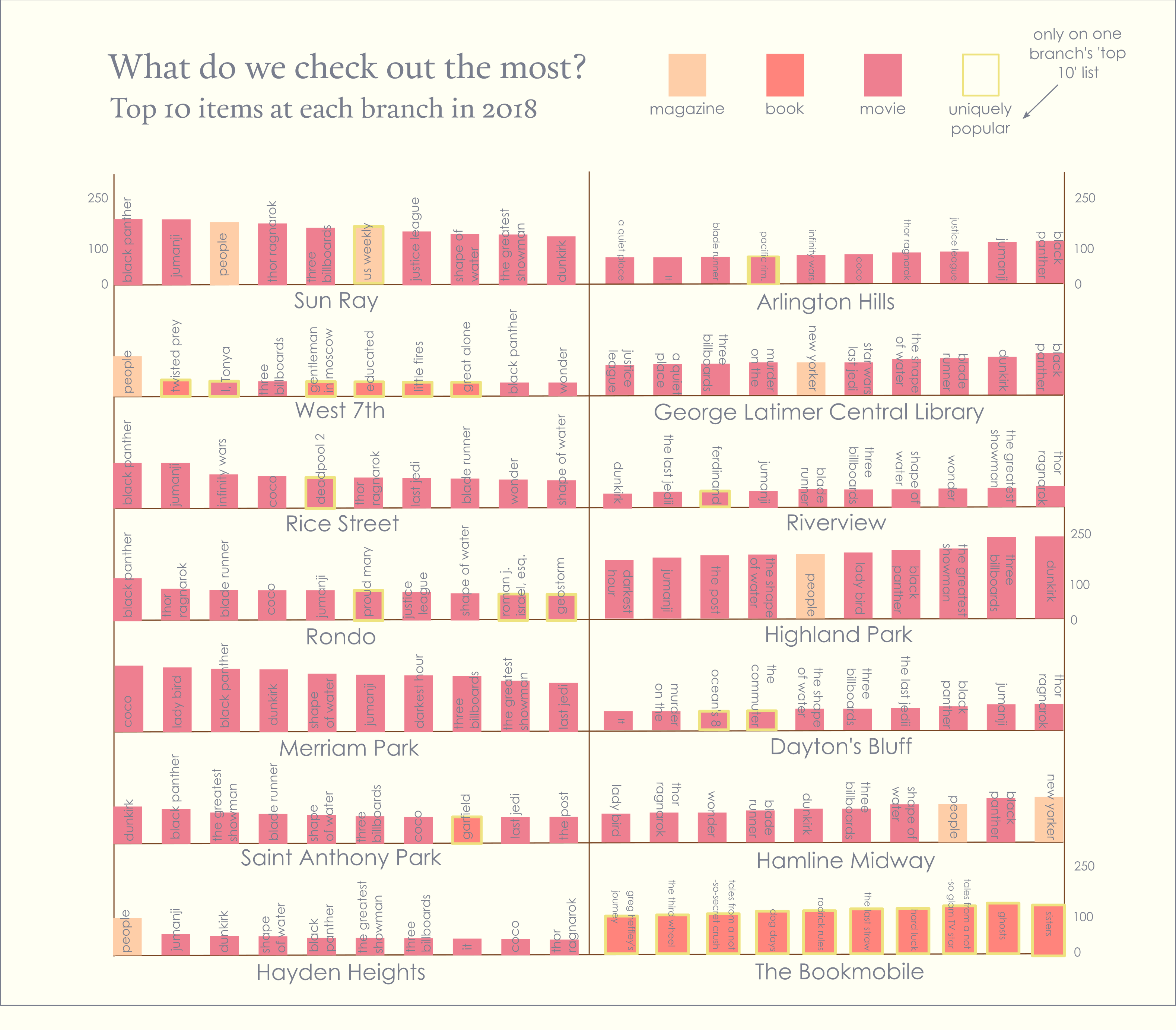
The graphic itself went through many iterations. For example in the version above I started by randomly placing branches on different shelves, trying to keep it relatively balanced.
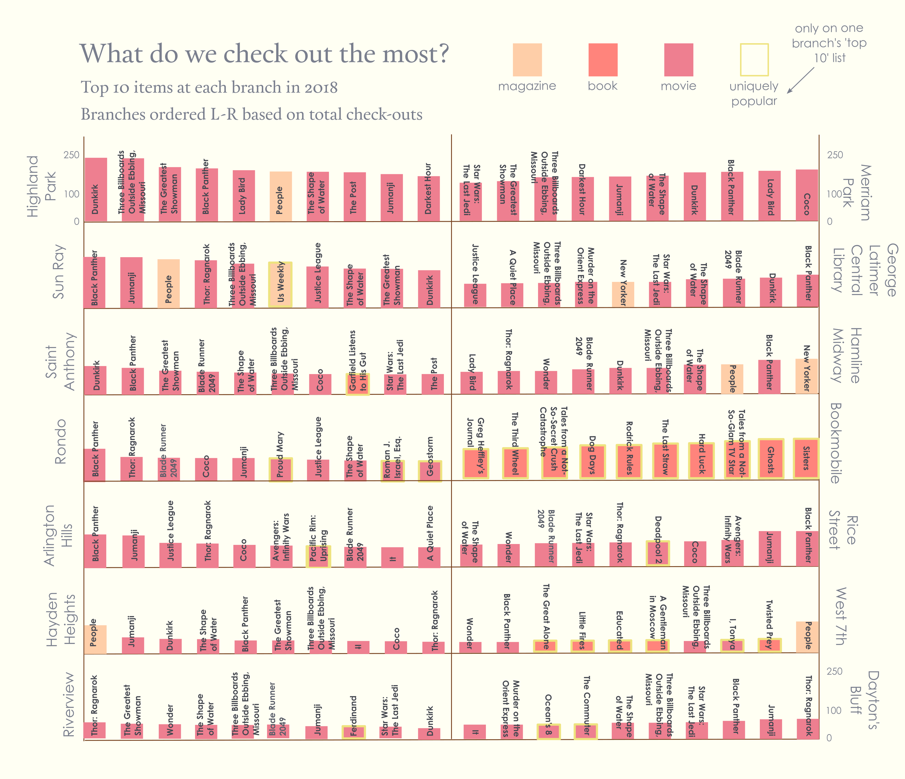
I then experimented with the text a bit. I moved the branch names to the side and bolded the titles.
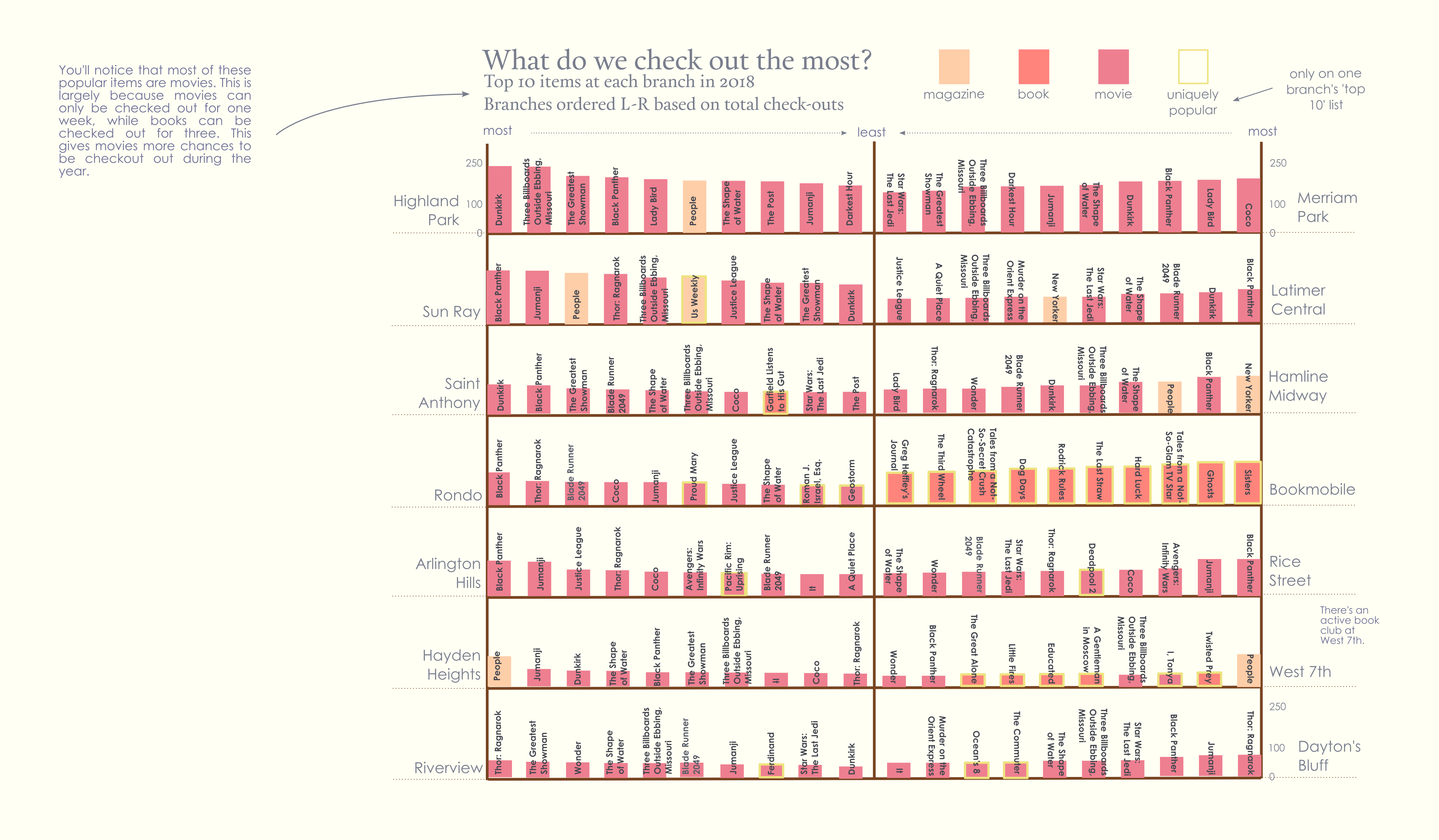
After that I started to experiment a bit more with adding some context in the form of a sidenote.
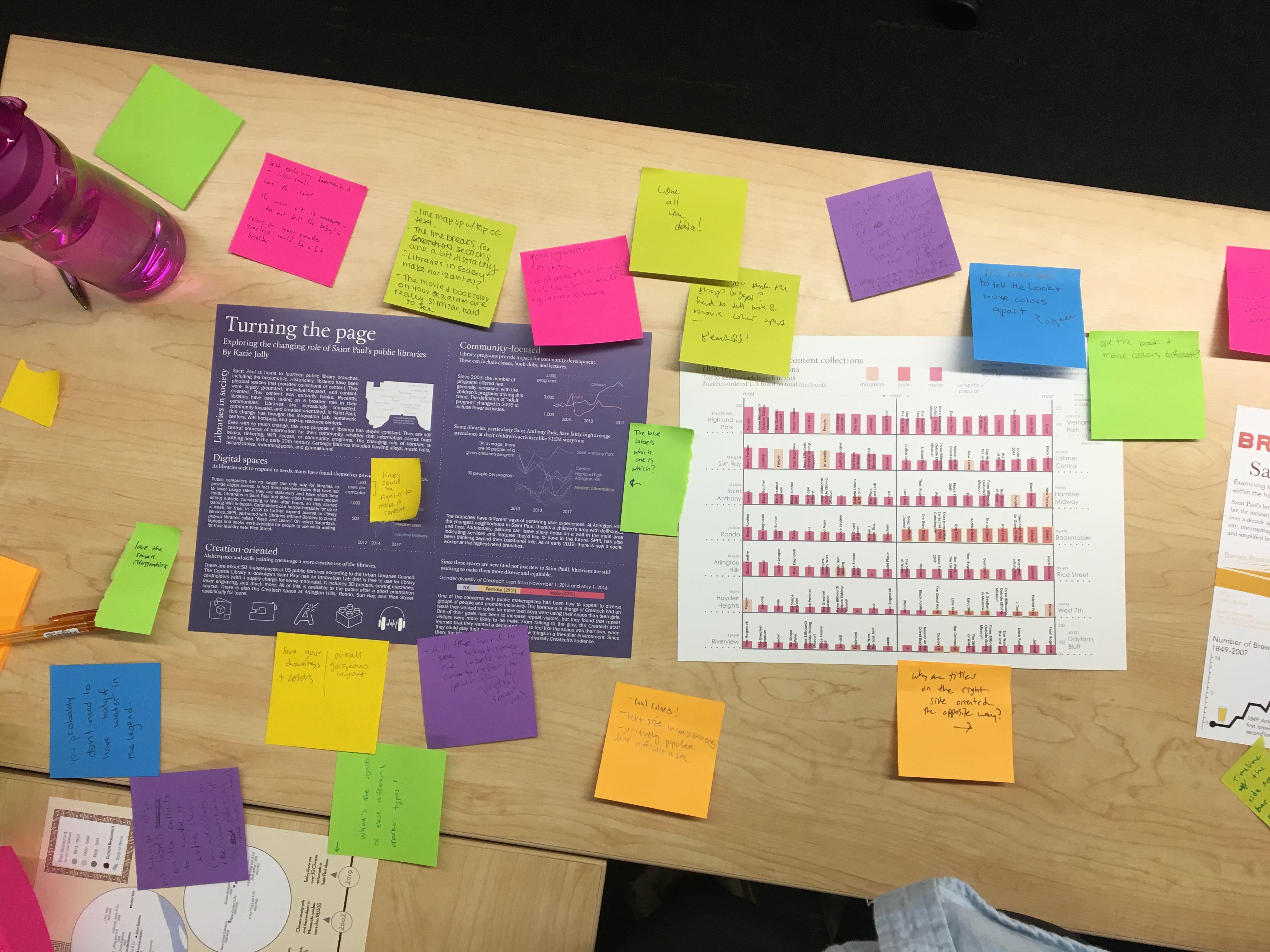
It ultimately went through many iterations. One of the most helpful parts of the process was a critique with the whole class. For the first part of the critique we used sticky notes to mark things we liked or wanted to change on all of the spreads, then discussed our spreads in small groups.
Ultimately I was really pleased with the final product! Here’s a quick before and after snapshot, using only the barchart from one branch, but I hope it’s clear how they all fit together.
Resources
Here are some resources I found particularly helpful:
- coolors.co for color schemes
- Design seeds for color schemes
- Field research for perspective
- The shape of words: An introdution to typography for text design
- Open foundry for open source fonts
- Inkscape tutorials for using Inkscape