@katiejolly6
on
Saint Paul park users love to bike, but not to fish
I’ve been attending Saint Paul Public Library’s data parties to help community members learn more about how to use the open data provided by the city and county. With those events I’ve been inspired to work more with the city’s open data to provide more examples of what sorts of things are available!
One dataset that I like a lot is the Parks and recreation community interest survey. The survey asks questions about things like what people use at parks, what they wish were improved, and how often they visit the park. I particularly like it because some of the text response columns provide an excellent example of messy data.
On the Open Information portal you can create basic visualizations. For example, here is one showing the respondents’ opinions about the importance of park facility repair.
And another about the quality of the regional parks.
These built-in chart generators are awesome, but I also think it’s fun
to be able to customize the charts a bit more in R. In this post I’ll
walk through the data cleaning and visualization process that I use.
Expect lots of factor recoding and reordering ahead. I also recently saw
some charts made with the ggchicklet package so I thought I’d give
that a try here. I like that it looks more casual and fun, I thought
that went well with the parks theme.
library(tidyverse)
library(ggchicklet)
library(showtext)
library(janitor)

font_add_google("Lato", regular.wt = 300, bold.wt = 400) # add google fonts, specifically lato
showtext_auto()
The survey data can be read in from the API endpoint provided by the
portal. If you’re someone who prefers to download your data first, you
can do so from the
webpage
under the Export
tab.
park_survey <- read_csv("https://information.stpaul.gov/resource/tahx-25ii.csv") %>%
  clean_names()

dim(park_survey)
## [1] 1000 102
The survey has 1,000 responses listed with 102 questions. More metadata is available online including a dataset preview, full survey questions, and more. I often found myself referencing the metadata because the full survey question usually did not fit in the column headers or it was abbreviated.
The data is formatted such that each column is a question and each row is one respondent. It looks like there is a maximum of one respondent per family. The survey is of people who live in Saint Paul about the park facilities in Saint Paul. If you want some inspiration of where to start with your analysis, the parks department has a report that uses this dataset. Theirs goes pretty in depth and I have to admit that I did not read it before starting to make my visualizations.
## # A tibble: 6 x 2
##   x1_on_average_how_frequently_does_~ x1_on_average_how_frequently_does_yo~
##   <chr>                               <chr>
## 1 A few times a week                  A few times a week
## 2 A few times a week                  A few times a week
## 3 A few times a year                  A few times a month
## 4 A few times a month                 A few times a week
## 5 A few times a month                 A few times a year
## 6 A few times a week                  A few times a week
Many of the questions are variants of one main question. For example, there are 17 questions asking about the quality of certain park features. You may want to analyze them individually, but for this analysis I wanted to analyze them all together. Luckily they are marked with the main question number which makes selecting based on that fairly simple.
I first wanted to know how often the respondents had actually used the park facilities.
I’ll start by selecting the questions associated with the frequency of use (question 1 according to the metadata). I then gather the data into a long dataset so that each row is a survey quesiton with its corresponding response. By doing this I’m ignoring the fact that these are not all indpendent answers, each person is counted 3 times. But for the purpose of this visualization I think that’s okay.
I then group my data by the question and response pairs to count how many people answered a certain way for each question. For example, how many people visited community centers about once per week? Lastly I’ll calculate the proportion of people that answered a certain way for each question.
x1 <- park_survey %>%
  select(contains("x1_")) %>%
  gather(key = "question", value = "response", 1:3) %>%
  group_by(question, response) %>%
  count() %>%
  group_by(question) %>%
  mutate(prop = n / sum(n))
## # A tibble: 6 x 4
## # Groups:   question [2]
##   question                                       response           n  prop
##   <chr>                                          <chr>          <int> <dbl>
## 1 x1_on_average_how_frequently_does_your_househ~ A few times a~   321 0.321
## 2 x1_on_average_how_frequently_does_your_househ~ A few times a~   283 0.283
## 3 x1_on_average_how_frequently_does_your_househ~ A few times a~   220 0.22
## 4 x1_on_average_how_frequently_does_your_househ~ Almost daily     103 0.103
## 5 x1_on_average_how_frequently_does_your_househ~ I/we don't us~    73 0.073
## 6 x1_on_average_how_frequently_does_your_househ~ A few times a~   246 0.246
You’ll notice that the questions aren’t worded nicely for labeling a
plot. To fix this I created a table of keywords to use as shorted
questions and then joined it to my x1 table.
questions <- tibble(
  question = unique(x1$question),
  keyword = c("Recreation and community centers", "Passive park and green spaces", "Regional parks")
)

x1 <- x1 %>%
  left_join(questions) %>%
  mutate(response = factor(response, levels = c("Almost daily",  "A few times a week", "A few times a month","A few times a year" , "I/we don't use this")))
On my plots I wanted the questions to be ordered by the proportion of people who use that facility daily. I couldn’t think of a great way to do that based on the way this data is structured, but the method below works well enough.
daily_rank <- x1 %>%
  filter(response == "Almost daily") %>% # just the proportions I'm interested in
  arrange(prop) %>% # in order
  pull(keyword) # just the keyword

x1 <- x1 %>%
  mutate(keyword = factor(keyword, levels = daily_rank)) # order the keyword by the vector created above
Now that I have the clean data I’ll make a stacked bar chart to show the proportions.
ggplot(x1, aes(x = keyword, y = prop, fill = response)) +
  geom_chicklet(width = 0.3) +
  coord_flip() +
  theme_minimal() +
  scale_fill_manual(values = c("#C70E7B", "#FC6882",  "#172869", "#1BB6AF", "#dae1ed")) +
  labs(caption = "Parks And Recreation Community Interest Survey Dataset, Summer 2016\nRetrieved from Saint Paul Open Information", title = "On average, how often does your family use:", y = "Proportion of responses", x = "") +
  theme(text = element_text(color = "#51576b"),
        axis.text = element_text(color = "#51576b")) +
  guides(fill = guide_legend(title = "Rating")) +
  scale_y_continuous(position = "left")
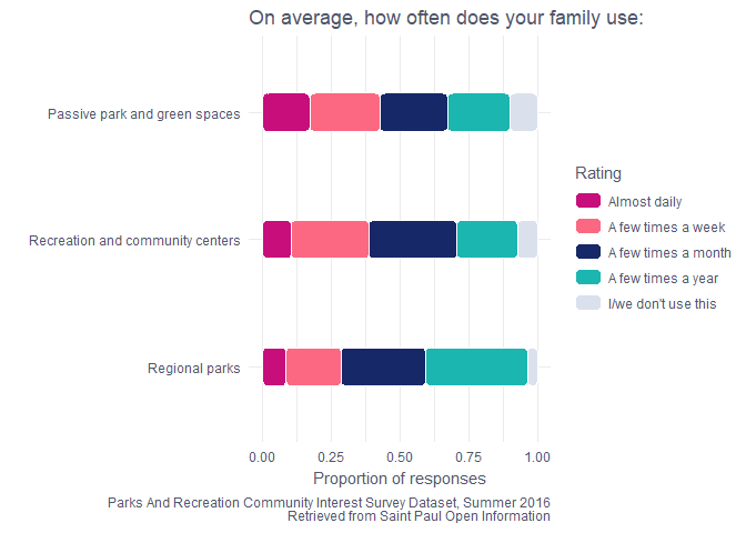
It looks like people are mostly visiting the green spaces! These are often neighborhood parks.
The next question I was interested in visualizing was people’s opinions of the park facilities. I’ll use a similar process as I walked through above to create this chart.
x2 <- park_survey %>%
  select(contains("x2")) %>% # pull out all the question 2 parts
  gather(key = "question", value = "response", 1:17) %>%
  group_by(question, response) %>%
  count() %>% # tally up the responses for each questions
  group_by(question) %>%
  mutate(prop = n / sum(n)) # proportion of response types

questions <- tibble(
  question = unique(x2$question),
  keyword = c("Athletic fields", "Basketball courts", "Biking trails", "Boating facilities", "Community centers", "Fishing areas", "Golf courses", "Off-leash dog parks", "Outdoor ice skating rinks", "Outdoor swimming pools", "Park restrooms", "Parking lots", "Picnic areas", "Picnic shelters", "Playground equiptment", "Tennis courts", "Walking trails and paths")
) # create more human readable labels

x2 <- x2 %>%
  left_join(questions) %>%
  mutate(response = factor(response, levels = c("Excellent", "Good", "Fair", "Poor", "I/we don't use this")))

excellent_rank <- x2 %>%
  filter(response == "Excellent") %>%
  arrange(prop) %>%
  pull(keyword) # rank the facilities by the proportion of people who rated them as excellent

x2 <- x2 %>%
  mutate(keyword = factor(keyword, levels = excellent_rank))


ggplot(x2, aes(x = keyword, y = prop, fill = response)) +
  geom_chicklet() +
  coord_flip() +
  theme_minimal() +
  scale_fill_manual(values = c("#C70E7B", "#FC6882",  "#172869", "#1BB6AF", "#dae1ed")) +
  labs(caption = "Parks And Recreation Community Interest Survey Dataset, Summer 2016\nRetrieved from Saint Paul Open Information", title = "Based on your experiences, rate your opinion of:", y = "Proportion of responses", x = "") +
  theme(text = element_text(color = "#51576b"),
        axis.text = element_text(color = "#51576b")) +
  guides(fill = guide_legend(title = "Rating"))
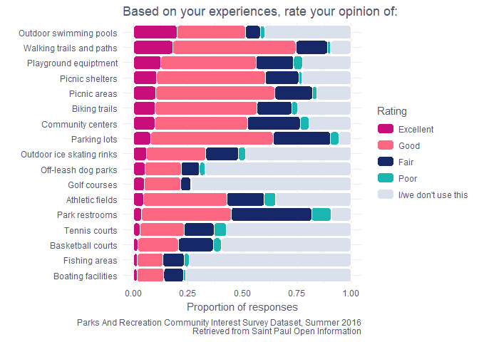
It seems like Saint Paul park users really like the outdoor swimming pools (an interesting first place in Minnesota), trails for walkers and bikers, picnics, playgrounds, community centers, and parking lots. They don’t love the boating facilities, restrooms, fishing areas, and sport-specific facilities. As a semi-regular park user, this pretty closely matches my opinions of the park facilities.
Now that we know what people like in the parks, I’m also interested in what they think the city should invest in. My guess was that things towards the upper-middle of the spectrum would be voted to have the highest priority for investment. My thinking was that those are things people already like but maybe could see some improvements. Something like a boating facility isn’t going to become a new favorite spot if the city adds some benches. There has to be the initial interest to make that improvement worthwhile in my opinion.
x4 <- park_survey %>%
  select(contains("x4"))%>%
  gather(key = "question", value = "response", 1:18) %>%
  group_by(question, response) %>%
  count() %>%
  group_by(question) %>%
  mutate(prop = n / sum(n))

questions <- tibble(
  question = unique(x4$question),
  keyword = c("Athletic fields", "Basketball courts", "Biking trails", "Boating facilities", "Community centers", "Fishing areas", "Golf courses", "Off-leash dog parks", "Outdoor ice skating rinks", "Outdoor swimming pools", "Park restrooms", "Parking lots", "Picnic areas", "Picnic shelters", "Playground equiptment", "Small neighborhood parks", "Tennis courts", "Walking trails and paths")
)

x4 <- x4 %>%
  left_join(questions) %>%
  mutate(response = factor(response, levels = c("Highest priority", "Priority", "Low priority", "Not a priority", "No opinion")))

priority_rank <- x4 %>%
  filter(response == "Highest priority") %>%
  arrange(prop) %>%
  pull(keyword)

x4 <- x4 %>%
  mutate(keyword = factor(keyword, levels = priority_rank))


ggplot(x4, aes(x = keyword, y = prop, fill = response)) +
  geom_chicklet() +
  coord_flip() +
  theme_minimal() +
  scale_fill_manual(values = c("#C70E7B", "#FC6882",  "#172869", "#1BB6AF", "#dae1ed")) +
  labs(caption = "Parks And Recreation Community Interest Survey Dataset, Summer 2016\nRetrieved from Saint Paul Open Information", title = "How would you prioritize investment in:", y = "Proportion of responses", x = "") +
  theme(text = element_text(color = "#51576b"),
        axis.text = element_text(color = "#51576b")) +
  guides(fill = guide_legend(title = "Rating"))
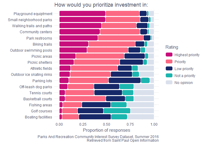
As I suspected, boating facilities got the lowest number of Highest
priority ratings. The playgrounds, small neighborhood parks, trails and
paths, community centers, and park restrooms all came up as high priority
items for many people. This makes sense, and they are also places where
small investments can go a long way for usability and enjoyment. For
example, weeding along trails or adding a picnic table to a small
neighborhood park.
The city also organizes a number of events at park facilities. Many people go to parks for a particular purpose, and events can help make people feel welcomed in the public spaces. Things like classes and festivals are some ways of recruiting new park users. For example, the parks host popular and free fitness and movie events that usually draw a crowd (myself included)! I was interested in the number of respondents that attended events.
x9 <- park_survey %>%
  select(contains("x9")) %>%
  rename(participation = x9_has_any_member_of_your_household_participated_in_any_city_parks_and_recreation_programs_in_the_1) %>%
  group_by(participation) %>%
  count() %>%
  ungroup()

ggplot(x9, aes(x = participation, y = n)) +
  geom_chicklet(fill = "#f5b44c", width = 0.2) +
  coord_flip() +
  theme_minimal() +
  theme(text = element_text(color = "#51576b"),
        axis.text = element_text(color = "#51576b")) +
  labs(caption = "Parks And Recreation Community Interest Survey Dataset, Summer 2016\nRetrieved from Saint Paul Open Information", title = "Has any member of your household participated in any City Parks and\nRecreation programs in the past year?", y = "Respondents", x = "")
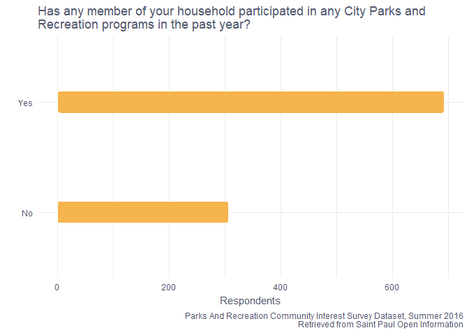
About 70% of the respondents had at least one family member who attended an event during the past year. That’s a pretty good number I think!
The survey also has information about what they thought of those programs.
x10 <- park_survey %>%
  select(contains("x10")) %>%
  rename(overall_quality_rating = x10_how_would_you_rate_the_overall_quality_of_the_program_s) %>%
  group_by(overall_quality_rating) %>%
  count() %>%
  ungroup() %>%
  mutate(overall_quality_rating = factor(overall_quality_rating, levels = c("I/we don't participate","Poor" , "Fair", "Good", "Excellent"))) %>%
  filter(overall_quality_rating != "I/we don't participate")

ggplot(x10, aes(x = overall_quality_rating, y = n)) +
  geom_chicklet(fill = "#f5b44c", width = 0.3) +
  coord_flip() +
  theme_minimal() +
  theme(text = element_text(color = "#51576b"),
        axis.text = element_text(color = "#51576b")) +
  labs(caption = "Parks And Recreation Community Interest Survey Dataset, Summer 2016\nRetrieved from Saint Paul Open Information", title = "How would you rate the overall quality of the program(s)?", y = "Respondents", x = "")
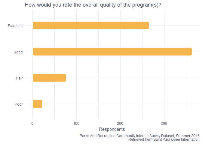
Most people who went to a program thought it was either excellent or good! There’s likely some selection bias here, people who go to park events are likely only going to go if they really think they’ll enjoy it.
Lastly, I was interested in what types of programs people thought were important. I can make a quick chart of that to see!
x12 <- park_survey %>%
  select(contains("x12"))%>%
  gather(key = "question", value = "response", 1:15) %>%
  group_by(question, response) %>%
  count() %>%
  group_by(question) %>%
  mutate(prop = n / sum(n))

# for this question in particular I had to use the metadata to translate the questions

questions <- tibble(
  question = unique(x12$question),
  keyword = c("Adult fitness and wellness", "Adult art, dance, and performing arts", "Adult sports", "After school programs", "Computer training", "Family programs", "Nature programs", "Pre-school programs", "Programs for disabled residents", "Seniors programs", "Youth summer camp", "Youth fitness and wellness", "Youth art, dance, and performing arts", "Youth sports", "Youth learn to swim")
)

x12 <- x12 %>%
  left_join(questions) %>%
  mutate(response = factor(response, levels = c("Very important", "Important", "Slightly important", "Not important")))

important_rank <- x12 %>%
  filter(response == "Very important") %>%
  arrange(prop) %>%
  pull(keyword)

x12 <- x12 %>%
  mutate(keyword = factor(keyword, levels = important_rank))


ggplot(x12, aes(x = keyword, y = prop, fill = response)) +
  geom_chicklet() +
  coord_flip() +
  theme_minimal() +
  scale_fill_manual(values = c("#C70E7B", "#FC6882",  "#172869", "#1BB6AF", "#dae1ed")) +
  labs(caption = "Parks And Recreation Community Interest Survey Dataset, Summer 2016\nRetrieved from Saint Paul Open Information", title = "How important to members of your household are\nthe types of recreation programs listed below:", y = "Proportion of responses", x = "") +
  theme(text = element_text(color = "#51576b"),
        axis.text = element_text(color = "#51576b")) +
  guides(fill = guide_legend(title = "Rating"))
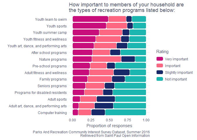
Saint Paul households love the youth programs! Many of the kids I know in Saint Paul learned to swim at a rec center and the camps seem popular. As an adult with no children I mostly attend the adult fitness and wellness programs, but I’m certainly not a representative user.
I hope this post was informative about public parks, Saint Paul Open Information, and/or data wrangling and visualization. If you look at any other questions in the survey I’m curious to know what you find! Go out and enjoy your local parks!