@katiejolly6
on
Reproducible Cartography Tips in R: Water Lines
Following up on my previous post on inner glows, I am going to talk about water lines. This is a style that uses similar calculations for a similar goal, just in a different way.
What are water lines?
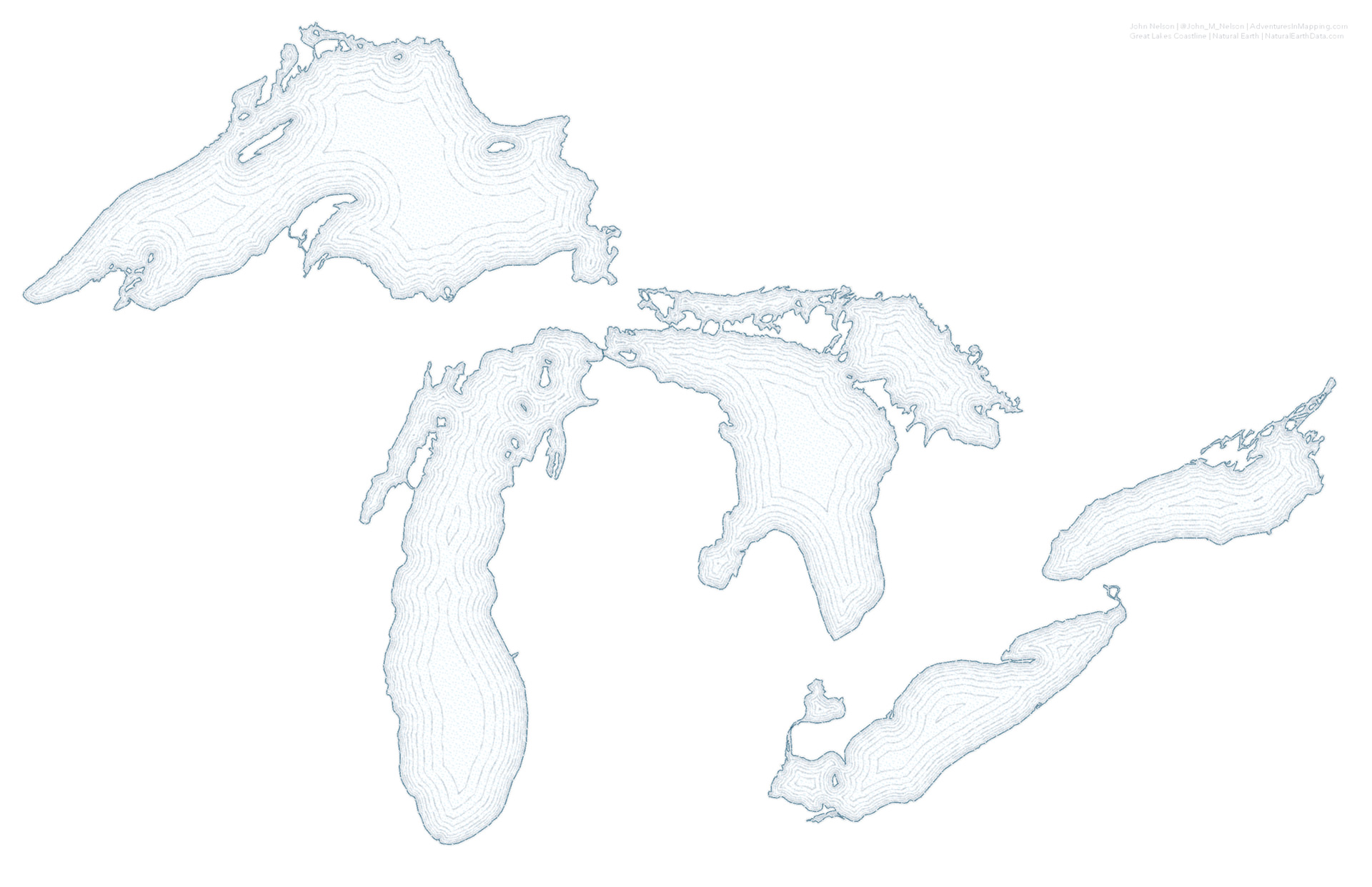
Water lines are another way of creating a figure-ground hierarchy in your maps. In a way they actually look like ripples in the water. The lines ripple out from the land at increasing intervals about 5 times (this is mostly personal preference). They help create some separation between land and water that isn’t as stark as a color change. Here is a nice example from John Nelson’s artcile Water lines… They need some space.
I’ll only show a few basic map styles today, but here are some other ones that I really love.

More Designing Tips for Vintage Maps in QGIS
Making the map
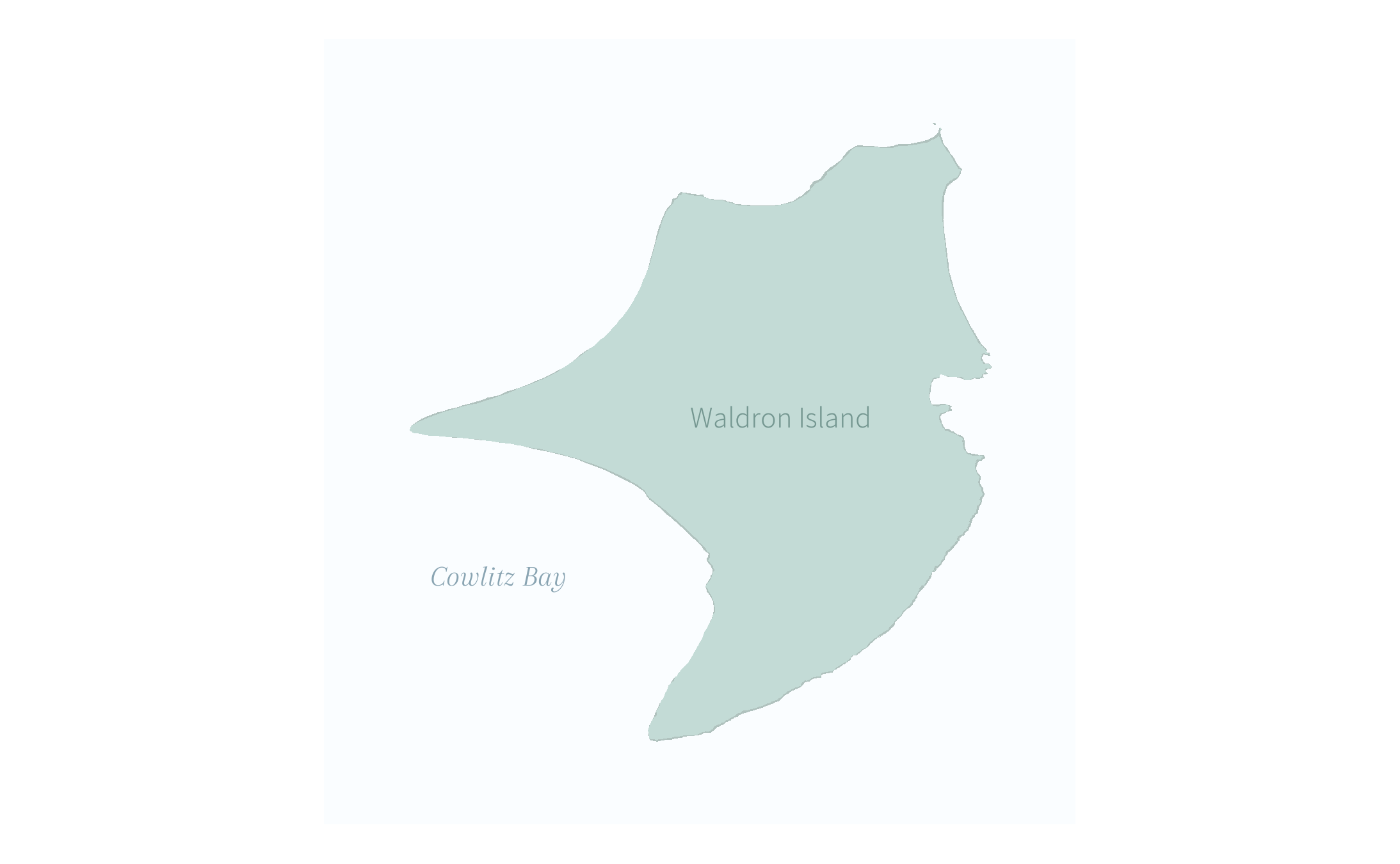
I’ll make a map with water lines of the Waldron Island in Washington. I won’t do much styling to the island itself and focus on the water instead.
Libraries to load
library(sf) # spatial data
library(tidyverse) # wrangling/cleaning
library(colorspace) # colors
library(showtext) # google fonts

font_add_google("Assistant", regular.wt = 300)
font_add_google("Arapey")
showtext_auto()
Getting data
I got a shapefile of the San Juan Islands from the San Juan County open data site and the water body shapefile from the WA State open data site. Both are available via the API as geojsons. I then reprojected the shapefiles to UTM 10N.
# water bodies in Washington
wa_water <- st_read("https://opendata.arcgis.com/datasets/28a0f93c33454297b4a9d3faf3da552a_1.geojson") %>%
  st_transform(26910) # from http://geo.wa.gov/datasets/wadnr::dnr-hydrography-water-bodies?geometry=-123.341%2C48.427%2C-122.298%2C48.586

# counties in Washington
san_juan_islands <- st_read("https://opendata.arcgis.com/datasets/1f8c6537e46d4c6aa6bd20ff466fb982_0.geojson") %>%
  st_transform(26910) # from https://data2017-01-09t190539232z-sjcgis.opendata.arcgis.com/datasets/island-shorelines?geometry=-123.429%2C48.550%2C-122.386%2C48.709
From the Islands shapefile, I just want Waldron Island. I thought it had a nice shape for this map and didn’t have too many small landmasses around it. A busy waterbody makes this technique more difficult in R.
I then filter out the waterbodies that I know are around the San Juans (from their online map explorer tool) and filtered to only near Waldon Island by cropping with the Waldron Island shapefile.
# get just Waldron Island

waldron <- san_juan_islands %>%
  filter(Island == "Waldron")

sj_water <- wa_water %>%
  filter(OBJECTID %in% c(5983, 176, 2542, 10487)) %>%
  st_crop(st_bbox(waldron) + c(-700, -700, 700, 700))
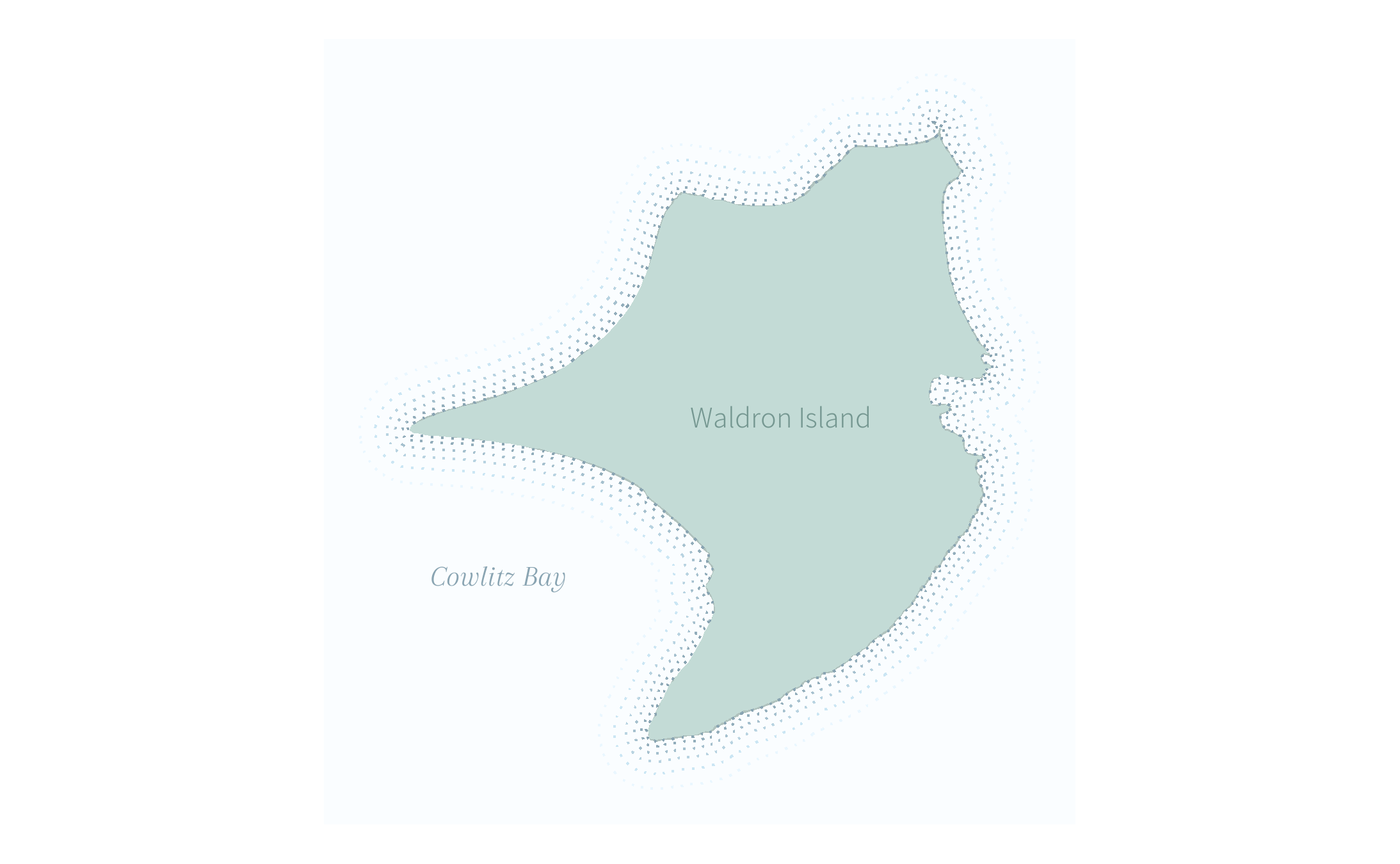
A basic map
If we just want to see what the island looks like, we can make a basic map with some labels. I chose these fonts from Google.
land_green <- "#c3dbd6"
water_fill <- "#FAFDFF"
water_outline <- "#89A4B2"

ggplot() +
  geom_sf(data = waldron, color = darken(land_green), fill = land_green) +
  geom_sf(data = sj_water, color = NA, fill = water_fill) +
  geom_sf_text(data = st_centroid(waldron), aes(label = "Waldron Island"), color = darken(land_green, 0.3), family = "Assistant", size = 12) +
  geom_text(aes(x = 495500, y = 5392800, label = "Cowlitz Bay"), color = water_outline, family = "Arapey", fontface = "italic", size = 12) +
  theme_void()
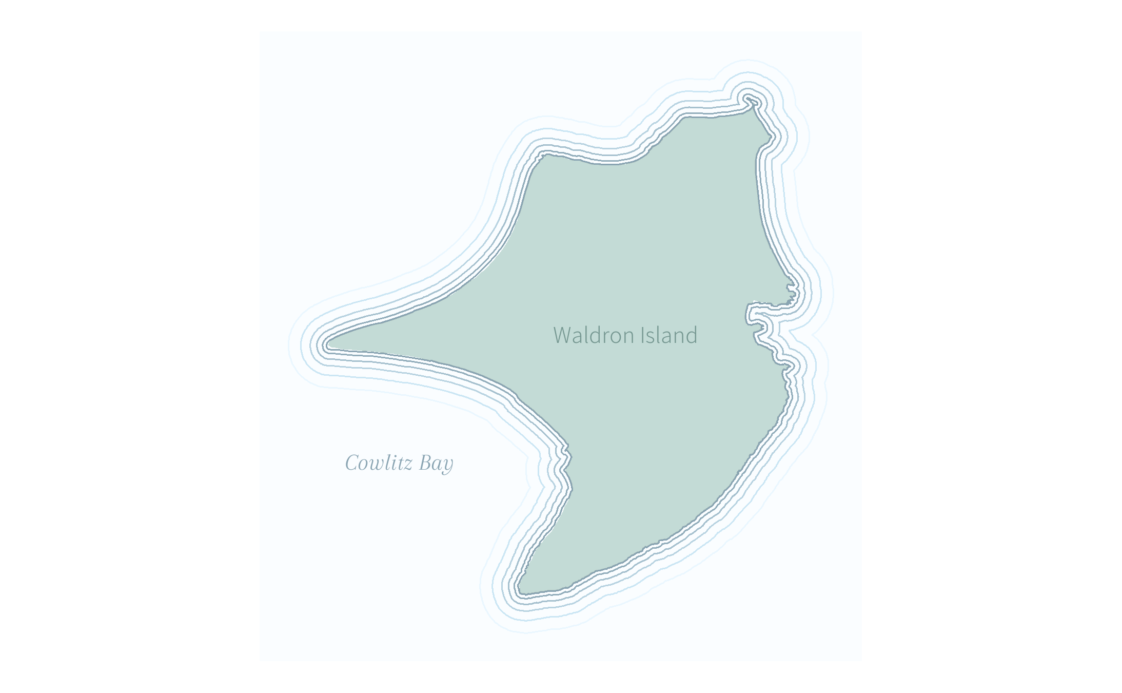
Adding water lines
Each water line is a negative buffer around the water, meaning it moves
back the border of the water by the buffer amount. If you have reach my
previous post, you might remember that the trick there was with the
fill aesthetic. Here the trick is with color, just to keep things
interesting :) I am incrementally lightening the color of the line as
the lines themselves get farther apart.
land_green <- "#c3dbd6"
water_fill <- "#FAFDFF"
water_outline <- "#89A4B2"

ggplot() +
  geom_sf(data = waldron, color = darken(land_green), fill = land_green) +
  geom_sf(data = sj_water, color = NA, fill = water_fill) +
  geom_sf(data = waldron %>% st_buffer(0), fill = NA, color = water_outline, lwd = 0.35) +
  geom_sf(data = waldron %>% st_buffer(40), fill = NA, color = lighten(water_outline), lwd = 0.35) +
  geom_sf(data = waldron %>% st_buffer(100), fill = NA, color = lighten(water_outline, 0.3), lwd = 0.35) +
  geom_sf(data = waldron %>% st_buffer(170), fill = NA, color = lighten(water_outline, 0.5), lwd = 0.35) +
  geom_sf(data = waldron %>% st_buffer(270), fill = NA, color = lighten(water_outline, 0.7), lwd = 0.35) +
  geom_sf(data = waldron %>% st_buffer(400), fill = NA, color = lighten(water_outline, 0.9), lwd = 0.35) +
  geom_sf_text(data = st_centroid(waldron), aes(label = "Waldron Island"), color = darken(land_green, 0.3), family = "Assistant", size = 12) +
  geom_text(aes(x = 495500, y = 5392800, label = "Cowlitz Bay"), color = water_outline, family = "Arapey", fontface = "italic", size = 12) +
  theme_void()
More design tweaks
I could also change the linetype for the water line, like in John Nelson’s example that I showed earlier.
ggplot2 gives us a few options. I’ll use dashed and dotted, but I
think the others would look nice as well!

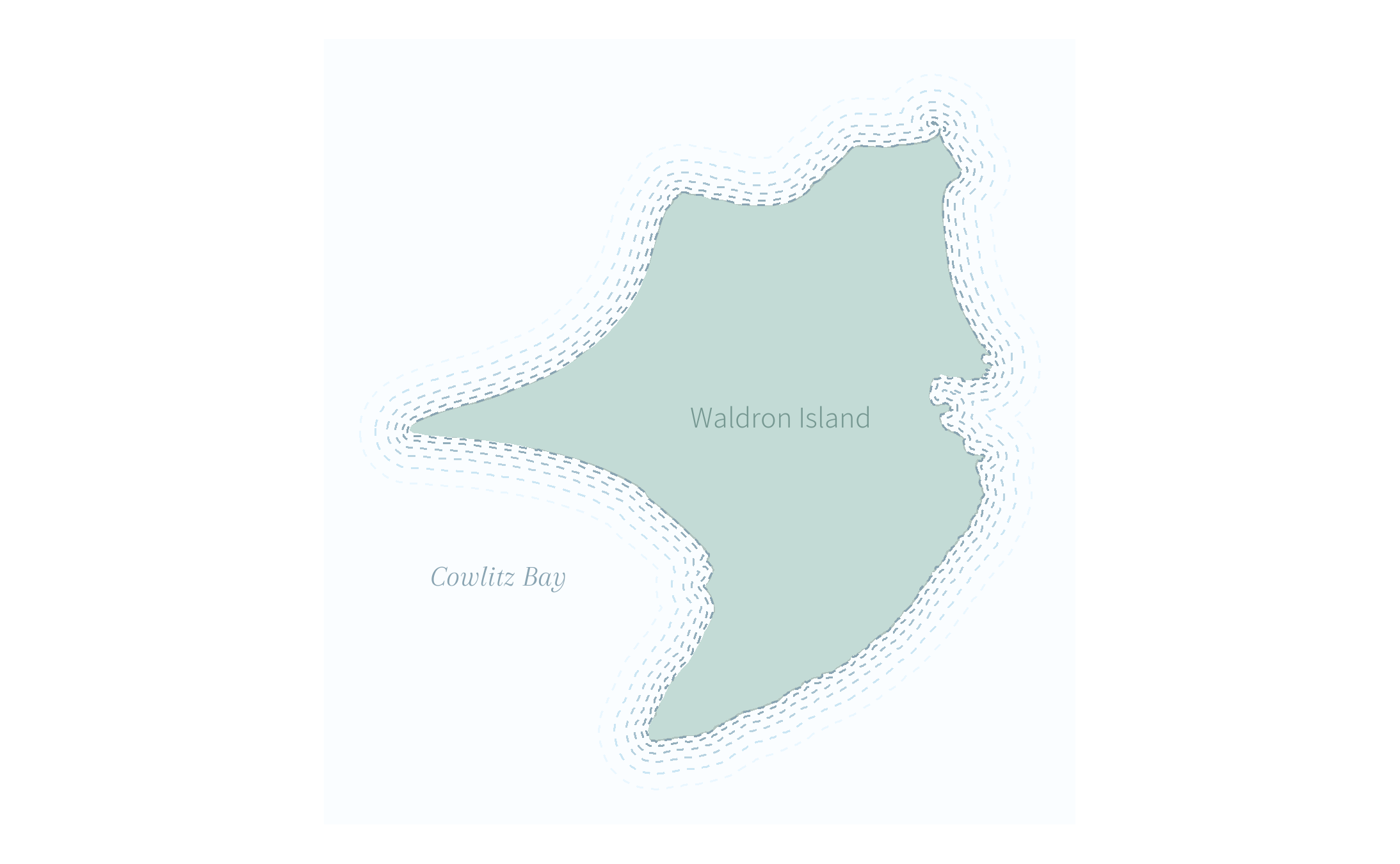
I first tried dashed lines:
ggplot() +
  geom_sf(data = waldron, color = darken(land_green), fill = land_green) +
  geom_sf(data = sj_water, color = NA, fill = water_fill) +
  geom_sf(data = waldron %>% st_buffer(0), fill = NA, color = water_outline, lwd = 0.35, linetype = 2) +
  geom_sf(data = waldron %>% st_buffer(40), fill = NA, color = lighten(water_outline), lwd = 0.35, linetype = 2) +
  geom_sf(data = waldron %>% st_buffer(100), fill = NA, color = lighten(water_outline, 0.3), lwd = 0.35, linetype = 2) +
  geom_sf(data = waldron %>% st_buffer(170), fill = NA, color = lighten(water_outline, 0.5), lwd = 0.35, linetype = 2) +
  geom_sf(data = waldron %>% st_buffer(270), fill = NA, color = lighten(water_outline, 0.7), lwd = 0.35, linetype = 2) +
  geom_sf(data = waldron %>% st_buffer(400), fill = NA, color = lighten(water_outline, 0.9), lwd = 0.35, linetype = 2) +
  geom_sf_text(data = st_centroid(waldron), aes(label = "Waldron Island"), color = darken(land_green, 0.3), family = "Assistant", size = 12) +
  geom_text(aes(x = 495500, y = 5392800, label = "Cowlitz Bay"), color = water_outline, family = "Arapey", fontface = "italic", size = 12) +
  theme_void()
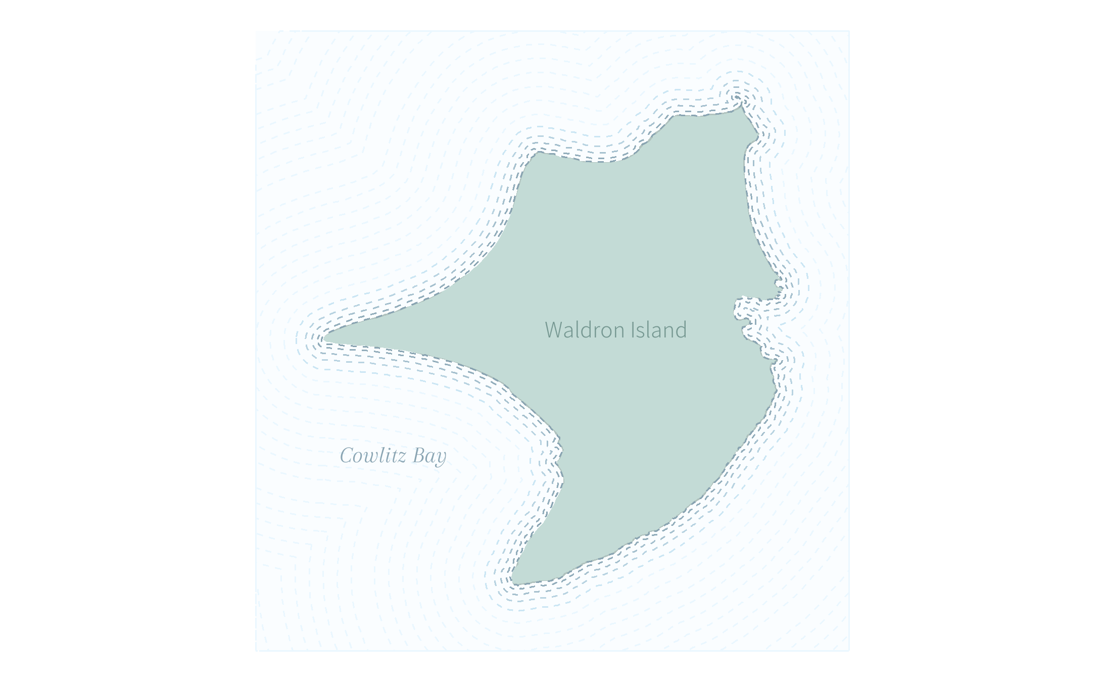
But I also really like the effect of dotted lines:
ggplot() +
  geom_sf(data = waldron, color = darken(land_green), fill = land_green) +
  geom_sf(data = sj_water, color = NA, fill = water_fill) +
  geom_sf(data = waldron %>% st_buffer(0), fill = NA, color = water_outline, lwd = .5, linetype = 3) +
  geom_sf(data = waldron %>% st_buffer(40), fill = NA, color = lighten(water_outline), lwd = .5, linetype = 3) +
  geom_sf(data = waldron %>% st_buffer(100), fill = NA, color = lighten(water_outline, 0.3), lwd = .5, linetype = 3) +
  geom_sf(data = waldron %>% st_buffer(170), fill = NA, color = lighten(water_outline, 0.5), lwd = .5, linetype = 3) +
  geom_sf(data = waldron %>% st_buffer(270), fill = NA, color = lighten(water_outline, 0.7), lwd = .5, linetype = 3) +
  geom_sf(data = waldron %>% st_buffer(400), fill = NA, color = lighten(water_outline, 0.9), lwd = .5, linetype = 3) +
  geom_sf_text(data = st_centroid(waldron), aes(label = "Waldron Island"), color = darken(land_green, 0.3), family = "Assistant", size = 12) +
  geom_text(aes(x = 495500, y = 5392800, label = "Cowlitz Bay"), color = water_outline, family = "Arapey", fontface = "italic", size = 12) +
  theme_void()
It makes the lines much more understated. If I were choosing between different linetypes, my decision would depend on colors, medium, audience, etc. All the usual considerations.
One last map I wanted to try was water lines radiating out to the edges of the plot. To do this I’ll need some liberal cropping. It’s more code than I like to write on-the-fly so I’ll write a quick water lines function.
create_waterline <- function(amt){
  waldron %>%
    st_buffer(amt) %>%
    st_crop(st_bbox(waldron) + c(-700, -700, 700, 700))
}
And then I can start adding that to my map. I’ll go with the dashed lines this time. For the lines rippling out to the edge, I plan to use the same color as the lightest line on my other maps.
ggplot() +
  geom_sf(data = waldron, color = darken(land_green), fill = land_green) +
  geom_sf(data = sj_water, color = NA, fill = water_fill) +
  geom_sf(data = create_waterline(0), fill = NA, color = water_outline, lwd = 0.35, linetype = 2) +
  geom_sf(data = create_waterline(40), fill = NA, color = lighten(water_outline), lwd = 0.35, linetype = 2) +
  geom_sf(data = create_waterline(100), fill = NA, color = lighten(water_outline, 0.3), lwd = 0.35, linetype = 2) +
  geom_sf(data = create_waterline(170), fill = NA, color = lighten(water_outline, 0.5), lwd = 0.35, linetype = 2) +
  geom_sf(data = create_waterline(270), fill = NA, color = lighten(water_outline, 0.7), lwd = 0.35, linetype = 2) +
  geom_sf(data = create_waterline(400), fill = NA, color = lighten(water_outline, 0.9), lwd = 0.35, linetype = 2) +
  geom_sf(data = create_waterline(550), fill = NA, color = lighten(water_outline, 0.9), lwd = 0.35, linetype = 2) +
  geom_sf(data = create_waterline(700), fill = NA, color = lighten(water_outline, 0.9), lwd = 0.35, linetype = 2) +
  geom_sf(data = create_waterline(850), fill = NA, color = lighten(water_outline, 0.9), lwd = 0.35, linetype = 2) +
  geom_sf(data = create_waterline(1000), fill = NA, color = lighten(water_outline, 0.9), lwd = 0.35, linetype = 2) +
  geom_sf(data = create_waterline(1150), fill = NA, color = lighten(water_outline, 0.9), lwd = 0.35, linetype = 2) +
  geom_sf(data = create_waterline(1300), fill = NA, color = lighten(water_outline, 0.9), lwd = 0.35, linetype = 2) +
  geom_sf(data = create_waterline(1450), fill = NA, color = lighten(water_outline, 0.9), lwd = 0.35, linetype = 2) +
  geom_sf(data = create_waterline(1700), fill = NA, color = lighten(water_outline, 0.9), lwd = 0.35, linetype = 2) +
  geom_sf(data = create_waterline(1850), fill = NA, color = lighten(water_outline, 0.9), lwd = 0.35, linetype = 2) +
  geom_sf(data = create_waterline(2000), fill = NA, color = lighten(water_outline, 0.9), lwd = 0.35, linetype = 2) +
  geom_sf(data = create_waterline(2150), fill = NA, color = lighten(water_outline, 0.9), lwd = 0.35, linetype = 2) +
  geom_sf(data = create_waterline(2300), fill = NA, color = lighten(water_outline, 0.9), lwd = 0.35, linetype = 2) +
  geom_sf(data = create_waterline(2450), fill = NA, color = lighten(water_outline, 0.9), lwd = 0.35, linetype = 2) +
  geom_sf(data = create_waterline(2700), fill = NA, color = lighten(water_outline, 0.9), lwd = 0.35, linetype = 2) +
  geom_sf(data = create_waterline(2850), fill = NA, color = lighten(water_outline, 0.9), lwd = 0.35, linetype = 2) +
  geom_sf(data = create_waterline(3000), fill = NA, color = lighten(water_outline, 0.9), lwd = 0.35, linetype = 2) +
  geom_sf_text(data = st_centroid(waldron), aes(label = "Waldron Island"), color = darken(land_green, 0.3), family = "Assistant", size = 12) +
  geom_text(aes(x = 495500, y = 5392800, label = "Cowlitz Bay"), color = water_outline, family = "Arapey", fontface = "italic", size = 12) +
  theme_void()
In the future I want to figure out how to use purrr to better draw
this plot because that’s a lot of copy/pasting.