@katiejolly6
on
How I Think About Map Design: Rural/Suburban/Urban Map
I recently designed a few maps during the 30 day map challenge. Each day during November has a different prompt and then cartographers across the world can post maps to fit each of those themes. I got a few questions about how I approach map design– particularly when designing things quickly. I wanted to talk through my process in depth for one of the maps that I made, Okay, but, what is a suburb?.
Brainstorming
This map was designed for the “population” theme. I had made a few maps that were more for aesthetics, but I wanted this one to tell some sort of story. One of my goals throughout the challenge was to practice using data visualization as a narrative tool. I wanted people to walk away from my maps with more questions and maybe some answers. To do this, I first thought about what questions I have (or have heard) about population.
One question I find myself thinking about a lot is how we classify neighborhoods and the people who live within them. These classifications can take many forms, but the discussion about what is urban/suburban/rural is particularly interesting to me. Like many residential planning questions this classification highly depends on where you’re drawing the boundaries. Are you looking at counties? Municipalities? Zip codes? Census tracts?
The second idea I had was to look at IRS county migration data. I wasn’t sure what exactly I was going to look for, but one thought was to look at counties that swung in major elections and looking to see where their most common within-US migrants came from. I had used this dataset previously to compare migration to Grand Rapids, MI and Detroit, MI and wanted to do something similar.
With only one day (and really just a few hours after work) to make the map, it’s important to narrow it down quickly and look at something specific. I found that brainstorming was often the part that took 90% of my time when I tried to find the perfect topic instead of just running with an idea. This is something I struggle with constantly. I decided to go with the rural/suburban/urban idea in the end but not for any specific reason.
Finding data
Over the last few years I’ve tried to make the data-finding process easier for myself. There’s no one way to do this, but I’ve learned a few good tips. The one that has been the most useful for me has been bookmarking articles, tweets, or anything else that mentions an interesting dataset. I also like to bookmark the data itself, but having the context from the article is key to figuring out quickly what the data might be able to tell you.
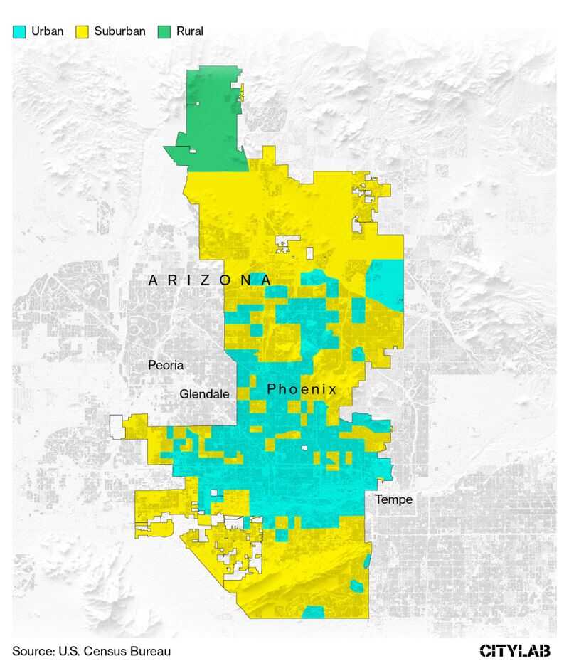
This past summer I read an article in CityLab by David Montgomery called How to Tell If You Live in the Suburbs (that I then quickly bookmarked!). He notes the fact that the majority of Americans say they live in a suburb “despite the category having no formal definition.” Suburbs are historically thought of as “allegedly white, middle class and socially homogenous” but that conception is outdated; today’s suburbs are remarkably diverse.
Montgomery spends most of the article discussing a dataset from researchers at The Dept. of Housing and Urban Development, Indeed.com, and The U.S. Census Bureau. The researchers surveyed 55,000 households asking “how would you classify your neighborhood” and then used that labeled data to model what demographic variables could best predict the neighborhood classification.
From Montgomery’s article:
Unsurprisingly, many people defined their neighborhoods in part by their population density. But a whole host of other factors also made the prediction more accurate. For example, areas with higher median incomes were more likely to be called suburban. Areas with older homes were more likely to be called urban. Areas with lots of senior citizens were more frequently called rural.
One fascinating case study is Phoenix, which just within the metro boundaries has a mix of urban, suburban, and rural.
The data itself includes a classification for each census tract in the U.S. as well as the raw % of how many people would classify their neighborhood as rural/suburban/urban. The researchers note that you should use the raw % with caution and encourage people to use their cleaned classification instead.
Creating the map
When designing any data visualization there are a few key things to keep in mind: who is your audience?, how is your audience viewing your work?, and what do you want them to learn from it?.
- Who is your audience?
I know that my audience will primarily be my followers on Twitter– typically data savvy and many are interested in planning/demographic/political topics. That means they’ll likely understand what a census tract is, for example.
- How is your audience viewing your work?
I was sharing all of my maps via my Twitter account so I tried hard to make each of them 1024px x 512px (the recommended image size for images in posts on Twitter). This means that the space available will be maximized and the image will look the best it can in that format.
- What do you want them to learn from it?
I want to use a representative state to highlight typical patterns in residential developments. I also want to introduce people to this really cool dataset and show them some of the things it can do.
I decided to focus on Virginia because (a) it’s a state I’m very familiar with which helps when working quickly, (b) it has a lot of variation between very rural and very urban areas, (c) it’s a state that most people know at least a few things about but is small enough to actually see the map on a phone screen on Twitter (no California or Texas, for example), and (d) it’s wider than it is tall so it looks good on a 1024px x 512px layout.
Enough thinking about the map, time to actually make it.
library(tidyverse) # data wrangling
library(tigris) # census boundaries
library(sf) # spatial data analysis
library(usethis) # downloading the data
library(ggnewscale) # more than one variable mapped to the fill aesthetic
You can download the
data
with this link or directly from the website. This code will unzip the
file into the destdir. Only run this code once (you only need to
download the data once). I run this code in my console rather than
putting it in an
RMarkdown.
use_zip("https://www.huduser.gov/portal/sites/default/files/zip/UPSAI_050820.zip", destdir "20-population")
Then you can read in the csv from the unzipped folder you just downloaded.
ahs_survey_2017 <- read_csv("20-population/UPSAI_050820/UPSAI_050820.csv") %>%
  janitor::clean_names() # I also like to clean up the column names

knitr::kable(head(ahs_survey_2017))
| geoid | statefp | countyfp | tractce | acs17_occupied_housing_units_est | upsai_urban | upsai_suburban | upsai_rural | upsai_cat_controlled |
|---|---|---|---|---|---|---|---|---|
| 01001020100 | 01 | 001 | 020100 | 754 | 0.0849 | 0.7614 | 0.1537 | 2 |
| 01001020200 | 01 | 001 | 020200 | 783 | 0.5107 | 0.4308 | 0.0585 | 1 |
| 01001020300 | 01 | 001 | 020300 | 1279 | 0.7039 | 0.2699 | 0.0262 | 1 |
| 01001020400 | 01 | 001 | 020400 | 1749 | 0.7698 | 0.1979 | 0.0323 | 1 |
| 01001020500 | 01 | 001 | 020500 | 4194 | 0.8656 | 0.1168 | 0.0176 | 1 |
| 01001020600 | 01 | 001 | 020600 | 1306 | 0.8567 | 0.1164 | 0.0270 | 1 |
I then downloaded the boundaries for Virginia tracts and counties using
tigris which pulls from the Census Tiger Line Files.
virginia_tracts <- tracts(state = "Virginia") %>%
  janitor::clean_names() %>%
  st_transform(26917) # use the UTM 17M projection

virginia_counties <- counties(state = "Virginia") %>%
  janitor::clean_names() %>%
  st_transform(26917)
Then I pulled out just the Virginia data and cleaned up the classifications.
virginia_tracts_class <- virginia_tracts %>%
  select(geoid, countyfp) %>%
  left_join(ahs_survey_2017) %>%
  mutate(upsai_cat_clean = case_when(
    acs17_occupied_housing_units_est == 0 ~ NA_real_, # I don't want to include places with 0 households, a personal choice
    TRUE ~ upsai_cat_controlled
    ),
         upsai_cat_desc = case_when(
           upsai_cat_clean == 1 ~ "Urban", # add labels
           upsai_cat_clean == 2 ~ "Suburban",
           upsai_cat_clean == 3 ~ "Rural",
           is.na(upsai_cat_clean) ~ "No occupied housing",
           TRUE ~ NA_character_
         ),
    urban_cat = cut(x = upsai_urban, breaks = c(0, .6, .85, 1)), # categorizations for map colors
    suburban_cat = cut(x = upsai_suburban, breaks = c(0, .6, .85, 1)),
    rural_cat = cut(x = upsai_rural, breaks = c(0, .6, .85, 1)))
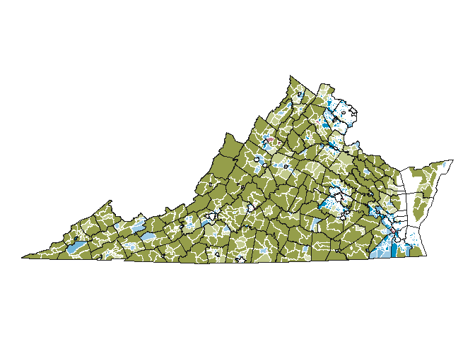
Now that the data is clean I can make the main state map. I first thought about just mapping the three cleaned categories but I thought there was useful data encoded in the %s as well. I wanted to use that to show “transition zones” between classifications. But since those are raw data, I wanted the overwhelming narrative (color) to be showing the cleaned classifications with a less distinctive use of shade to denote the degree of confidence.
By default ggplot2 does not allow more than one variable to be mapped
to one aesthetic but in this case I want to map 3 variables
(urban_cat, suburban_cat, and rural_cat) to fill, each with
their own color scheme. The ggnewscale package is a really helpful way
to accomplish this and that’s what I’ve used here.
# set the color schemes
reds <- c("#733D47", "#BE7D88", "#D2A8AF")
greens <- c("#959E4A", "#C2CA8C", "#D7DDB4")
blues <- c("#0091C1", "#71B4D7", "#9ECBE5")


detail_map <- ggplot() +
  geom_sf(data = virginia_tracts_class %>%
            filter(upsai_cat_desc == "Urban"), aes(fill = urban_cat), lwd = 0.02, color = "white", show.legend = FALSE) + # add urban data to the map
  scale_fill_manual(values = rev(reds)) +
  new_scale_fill() + # reset the fill scale
  geom_sf(data = virginia_tracts_class %>%
            filter(upsai_cat_desc == "Suburban"), aes(fill = suburban_cat), lwd = 0.02, color = "white", show.legend = FALSE) + # add surburban
  scale_fill_manual(values = rev(blues)) +
  new_scale_fill() + # reset the fill scale
  geom_sf(data = virginia_tracts_class %>%
            filter(upsai_cat_desc == "Rural"), aes(fill = rural_cat), lwd = 0.02, color = "white", show.legend = FALSE) +
  scale_fill_manual(values = rev(greens)) +
  geom_sf(data = virginia_counties, color = "gray10", lwd = 0.05, fill = NA) + # add county boundaries to help people orient themselves
  theme_void()

detail_map
# save to the directory with specific dimensions

# ggsave("20-population/detailed_map.png", detail_map, dpi = 300, width = 12, height = 9)
Designing the layout
The layout was designed in Illustrator, only the maps were made with R. Inkscape is a great free alternative to Illustrator!
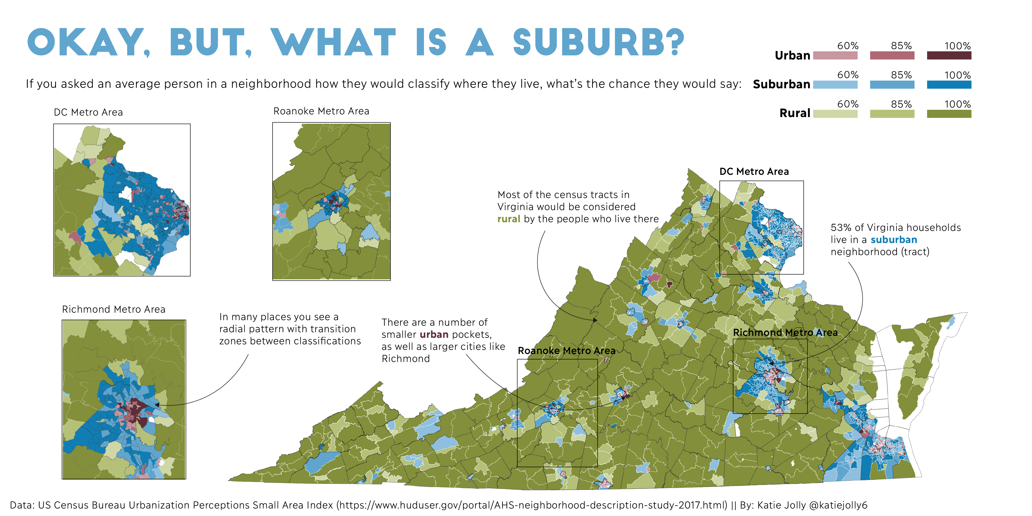
At this point this was the only map I was going to include. I was planning to just use text annotations to highlight particular metro areas. I saw that there was quite a bit of empty space in the layout and that some of the metros were hard to see so I decided to use insets instead.
Insets
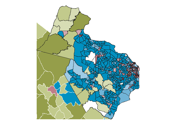
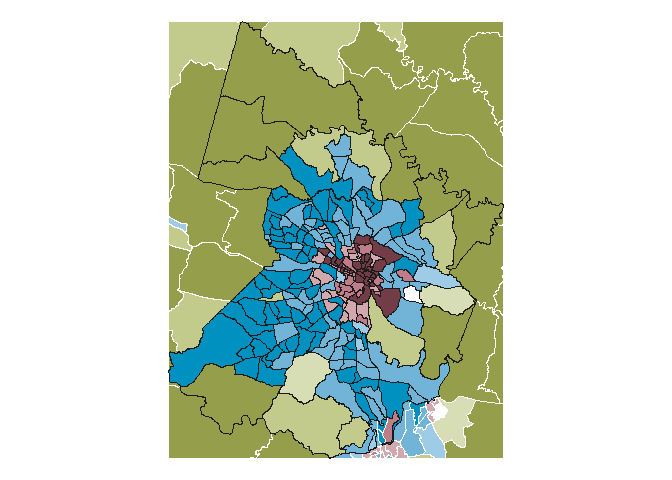
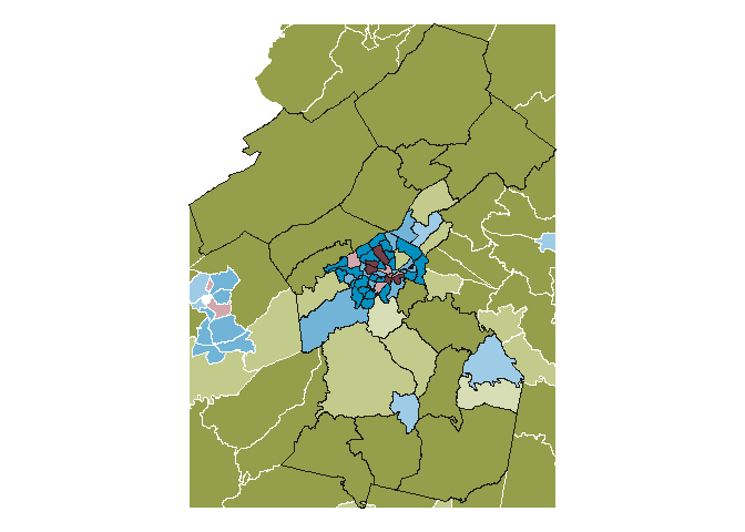
I decided to use the D.C. area (major metro area), Richmond area (Virginia’s largest city), and the Roanoke area (an isolated urban hub in otherwise rural southwestern Virginia).
For each of these cities I found counties considered to be in the metro area > cropped the tracts using a bounding box > made the map.
dc_counties <- virginia_tracts_class[virginia_tracts_class$countyfp %in% c("510", "600", "610", "153", "107", "059", "013", "683", "685"), ]

dc_inset <- st_crop(virginia_tracts_class, st_bbox(dc_counties))

dc_map <- ggplot() +
  geom_sf(data = dc_inset %>%
            filter(upsai_cat_desc == "Urban"), aes(fill = urban_cat), lwd = 0.08, color = "white", show.legend = FALSE) +
  scale_fill_manual(values = rev(reds)) +
  new_scale_fill() +
  geom_sf(data = dc_inset %>%
            filter(upsai_cat_desc == "Suburban"), aes(fill = suburban_cat), lwd = 0.08, color = "white", show.legend = FALSE) +
  scale_fill_manual(values = rev(blues)) +
  new_scale_fill() +
  geom_sf(data = dc_inset %>%
            filter(upsai_cat_desc == "Rural"), aes(fill = rural_cat), lwd = 0.08, color = "white", show.legend = FALSE) +
  scale_fill_manual(values = rev(greens)) +
  geom_sf(data = dc_counties, color = "gray10", lwd = 0.2, fill = NA) +
  theme_void()

dc_map
# ggsave("20-population/dc_map.png", dc_map, dpi = 300, width = 5, height = 5)
richmond_counties <- virginia_tracts_class[virginia_tracts_class$countyfp %in% c("041", "087", "085", "760"), ]

richmond_inset <- st_crop(virginia_tracts_class, st_bbox(richmond_counties))

richmond_map <- ggplot() +
  geom_sf(data = richmond_inset %>%
            filter(upsai_cat_desc == "Urban"), aes(fill = urban_cat), lwd = 0.08, color = "white", show.legend = FALSE) +
  scale_fill_manual(values = rev(reds)) +
  new_scale_fill() +
  geom_sf(data = richmond_inset %>%
            filter(upsai_cat_desc == "Suburban"), aes(fill = suburban_cat), lwd = 0.08, color = "white", show.legend = FALSE) +
  scale_fill_manual(values = rev(blues)) +
  new_scale_fill() +
  geom_sf(data = richmond_inset %>%
            filter(upsai_cat_desc == "Rural"), aes(fill = rural_cat), lwd = 0.08, color = "white", show.legend = FALSE) +
  scale_fill_manual(values = rev(greens)) +
  geom_sf(data = richmond_counties, color = "gray10", lwd = 0.2, fill = NA) +
  theme_void()

richmond_map
# ggsave("20-population/richmond_map.png", richmond_map, dpi = 300, width = 5, height = 5)
roanoke_counties <- virginia_tracts_class[virginia_tracts_class$countyfp %in% c("023", "045", "067", "161", "770", "775"), ]

roanoke_inset <- st_crop(virginia_tracts_class, st_bbox(roanoke_counties))

roanoke_map <- ggplot() +
  geom_sf(data = roanoke_inset %>%
            filter(upsai_cat_desc == "Urban"), aes(fill = urban_cat), lwd = 0.08, color = "white", show.legend = FALSE) +
  scale_fill_manual(values = rev(reds)) +
  new_scale_fill() +
  geom_sf(data = roanoke_inset %>%
            filter(upsai_cat_desc == "Suburban"), aes(fill = suburban_cat), lwd = 0.08, color = "white", show.legend = FALSE) +
  scale_fill_manual(values = rev(blues)) +
  new_scale_fill() +
  geom_sf(data = roanoke_inset %>%
            filter(upsai_cat_desc == "Rural"), aes(fill = rural_cat), lwd = 0.08, color = "white", show.legend = FALSE) +
  scale_fill_manual(values = rev(greens)) +
  geom_sf(data = roanoke_counties, color = "gray10", lwd = 0.2, fill = NA) +
  theme_void()

roanoke_map
# ggsave("20-population/roanoke_map.png", roanoke_map, dpi = 300, width = 5, height = 5)
I then pulled each of these maps into Illustrator and drew approximate rectangles around where they were on the main map. I used labels instead of arrows to mark each one.
Legend
I wanted the legend to be more than just listing the categories so I combined it with the subtitle. I used only 3 categories for each classification because any more than that would make the legend too complicated for a map that someone might quickly glance at while scrolling and because the colors would get more difficult to distinguish.
Annotation
Annotation should always add to the narrative, not just add words to the map. I.e. your users should learn something from the annotations that they wouldn’t have otherwise seen/learned from your map. I used my annotation space to describe the radial pattern around a metro area (even though people could see this on their own, it’s a main point of the map and worth reiterating to help guide people on how to read it) and give some summary statistics and commentary about households.
Pulling it all together
The last major design category here is typography (what fonts to use and how to use them). I chose a simple sans serif font (Ilisarniq) for the map text and a more interesting title font (Big John) to draw attention to the map in the busy social media space. I used color with the font to help people make quick associations based on the colors in the map (for example making the title blue because the question is about suburbs specifically).
I also always make sure to put credits (both to the data and to myself) at the bottom so that people know where to check my work or get more information!
I hope this post is useful for learning about how I think about data visualization. I’ve learned a lot of these tips over the years from reading other blog posts and articles as well and it’s taken lots of practice to put it all together! Feel free to leave a comment or reach out on twitter if you have more questions for me!