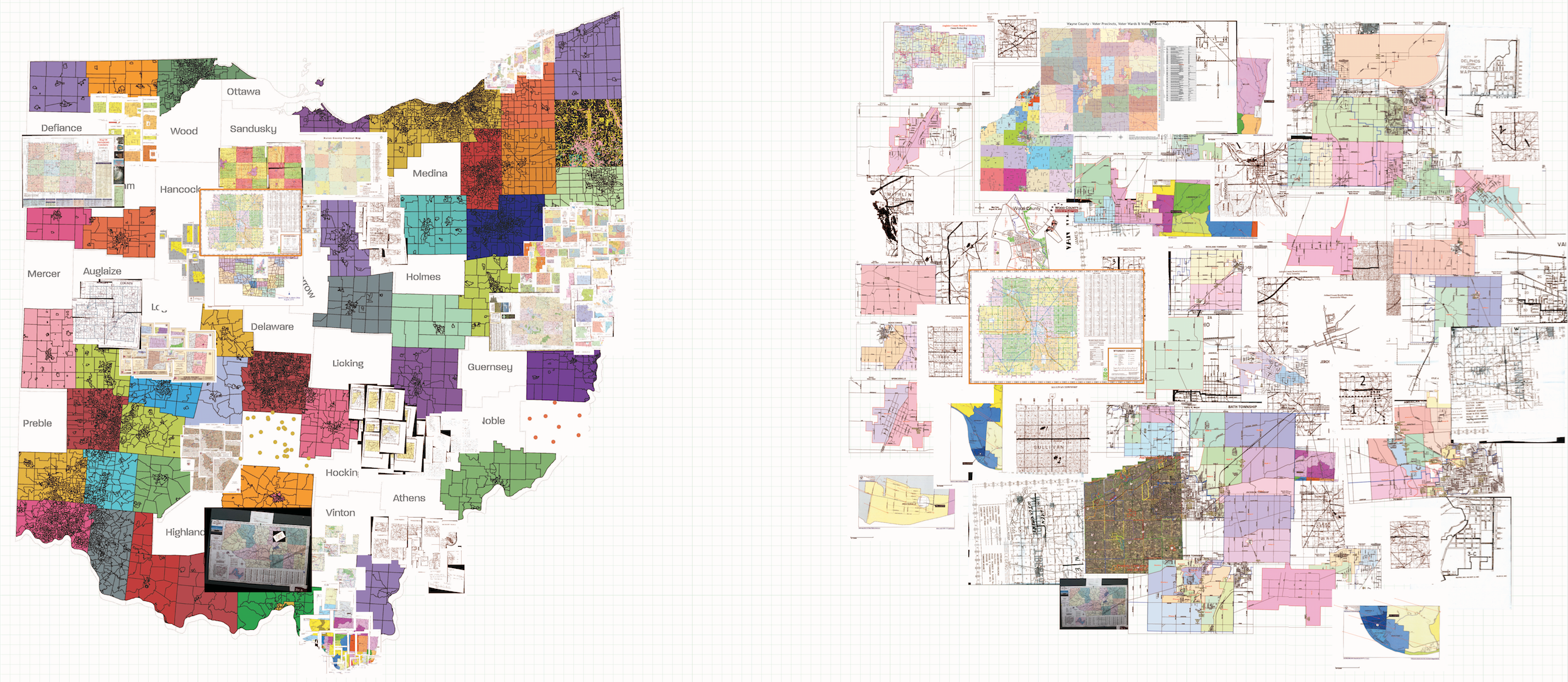
Ohio Precincts Project
The Ohio Project is a collaborative effort to create the first open source precinct shapefile for the state of Ohio. I’ve been co-maintaining it since the summer of 2018 and I’ve learned a lot about open-source and reproducible work in the process. If you’re interested in our work, you can check out the GitHub repository where we keep the most updated versions. If you have questions about the work, I’d be more than happy to chat with you!
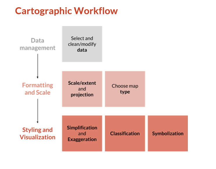
Map Design Guide
I spend a lot of time designing and making my own maps, and I’ve started to teach more people how to do the same. I also care that people are learning how to make maps that are informative and serve a purpose. In 2018, I worked with a group of other researchers at the Voting Rights Data Institute to put together an introductory-level map design guide to help us with our own teaching.
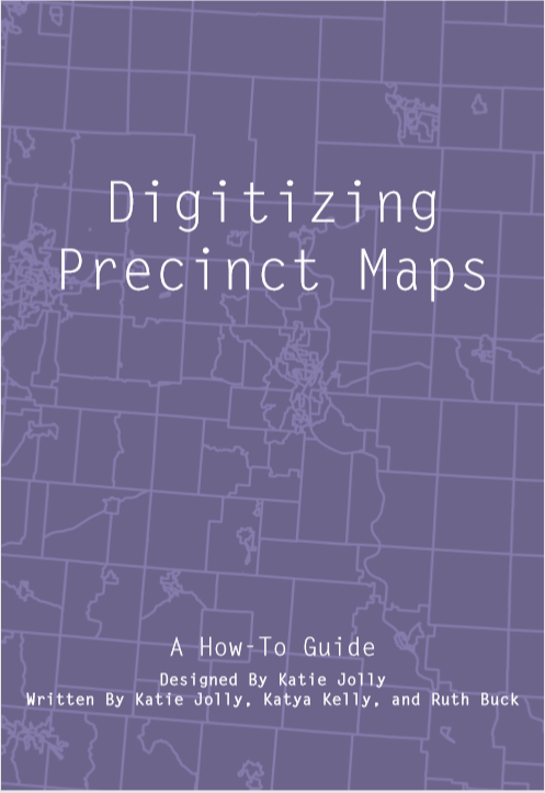
Map Digitizing Guide
The full guide is available here and is available for public use (we just ask that you give us credit). A lot of my work involves digitizing maps so that they can be used in GIS software and for geographic data science projects. Recently I have been working with voting precinct maps in particular. As part of that work, I collaborated with two other co-authors to write a quick guide that could help us when we led large workshops.
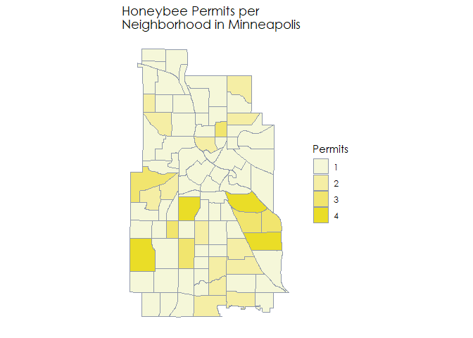
An Introduction to Geographic Data Science in R with Honeybees
This activity is adapted from my talk at R Ladies- Twin Cities on November 7, 2018. Enjoy! The activity covers spatial data formats, spatial joins, and some intro spatial autocorrelation. It uses honeybee permits data and neighborhood polygons from the City of Minneapolis to talk about geographic data science in R. It’s available here! Some screenshots from the activity to give you an idea of what it looks like:
Exploring dc's bikeshare system: data wrangling with dplyr
At my office hours for Introduction to Data Science (COMP 112) one night, some students mentioned they felt like they needed more practice with data wrangling and dplyr. So the next day I wrote an activity for them to work through. It ended up being really helpful for the students who worked on it with me and made them much more confident in using dplyr! I’ve also presented this activity at R Ladies- Twin Cities.
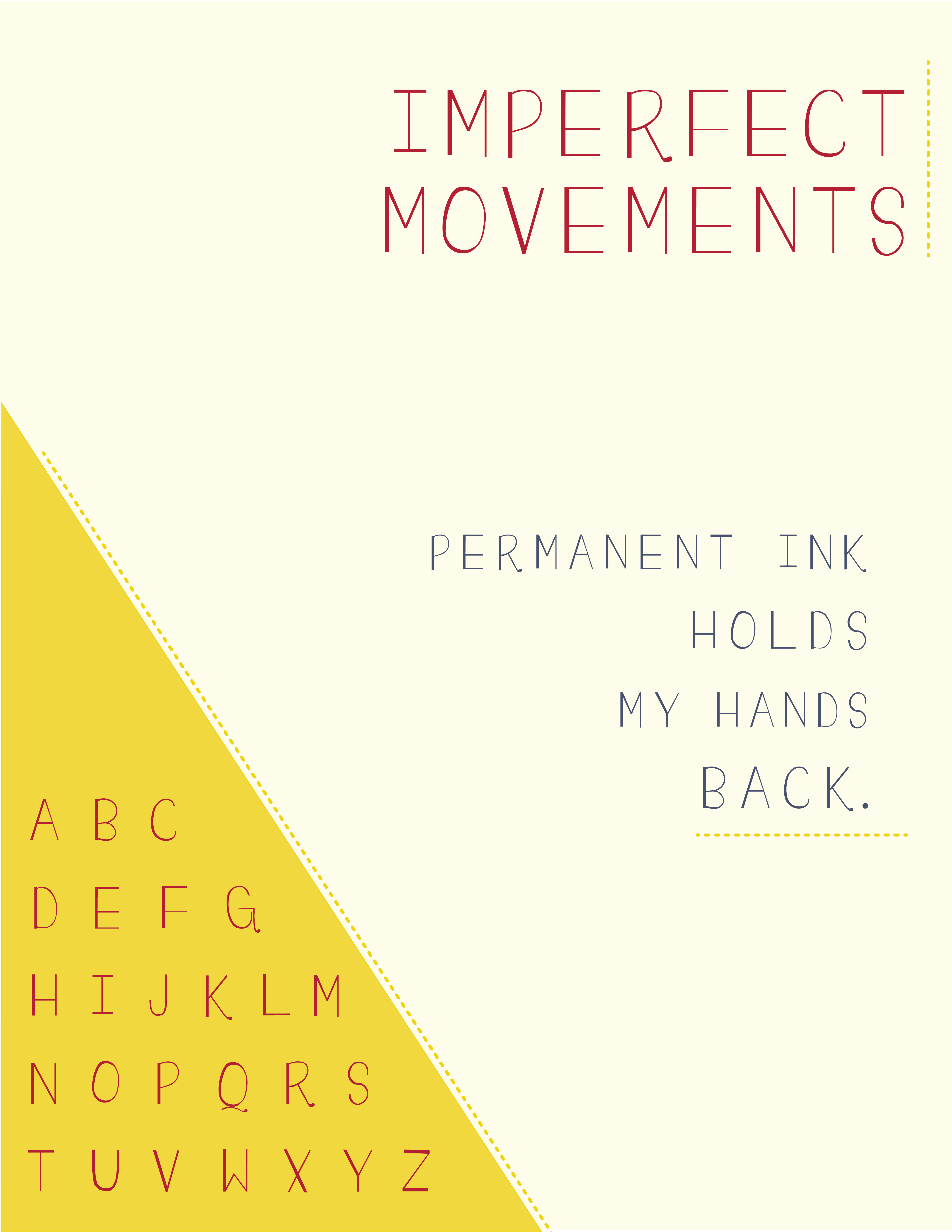
Typeface Poster
To learn more about typography, I created my own typeface. I also made a poster to show it off!
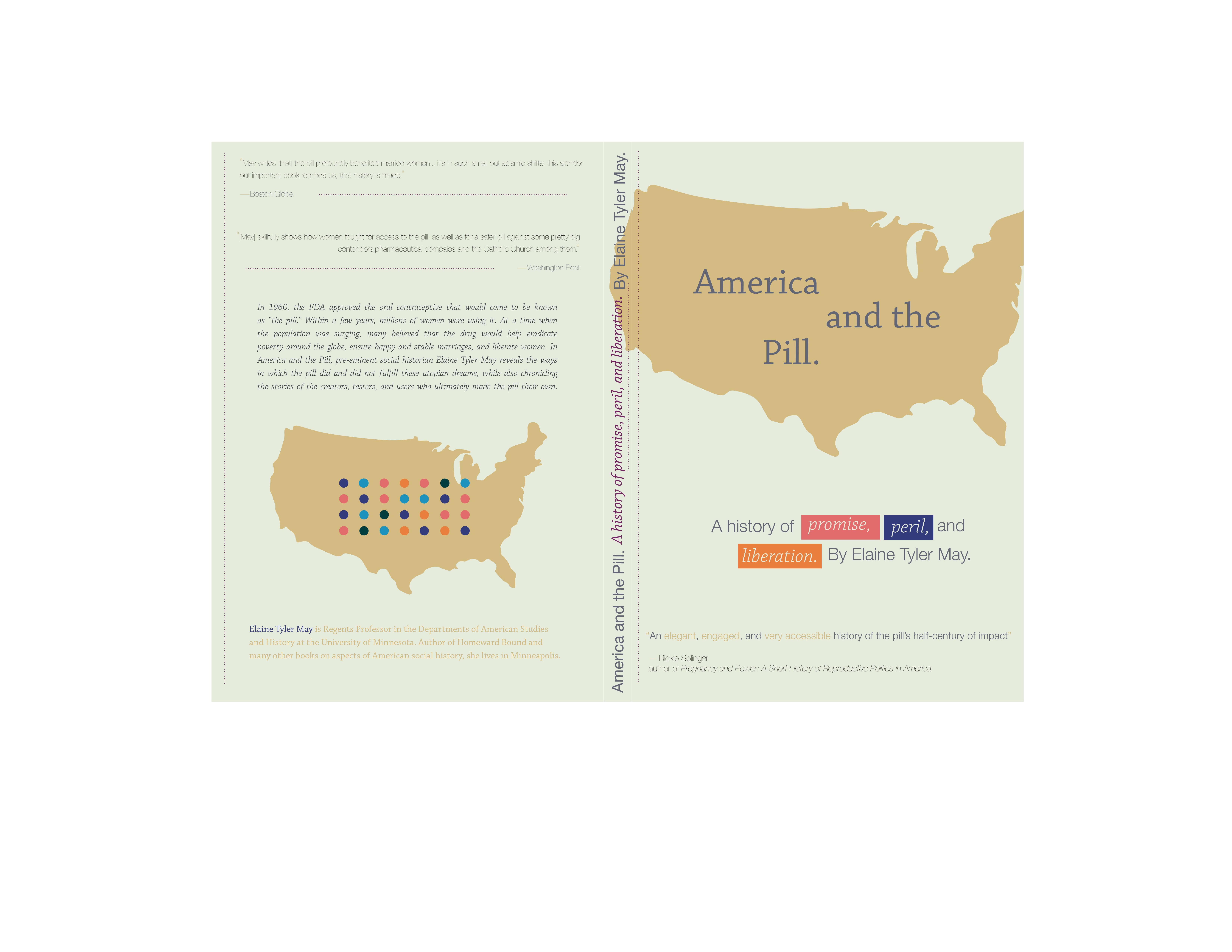
Book Cover
I redesigned the book cover for America and the Pill by Elaine Tyler May in the style of Carin Golderg, an accomplished designer. I used muted colors, Swiss Modernism fonts, bright highlight colors, simple illustrations, and creative text structures to follow that style.
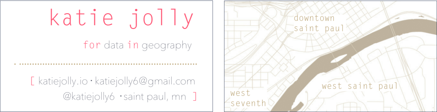
Business Card
For my design class we made business cards (or art cards) that we thought represented us well. I decided to make a map of some of Saint Paul on one side of my card and include my contact info on the other side. It went through a few iterations until I finally settled on one that I liked the most! The map was made with tigris and ggplot2 in R.
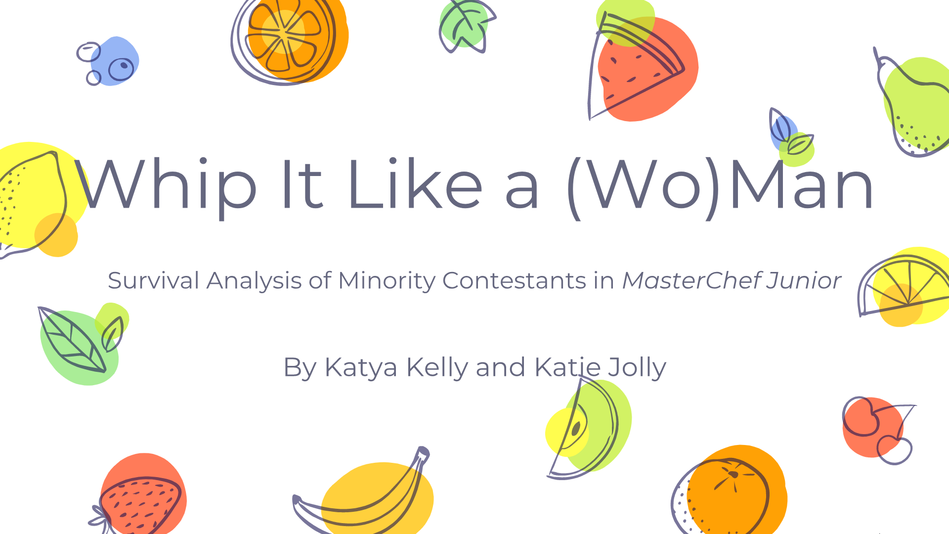
Whip It Like a (wo)Man: A Survival Analysis of Minority Contestants on MasterChef Junior
In Fall 2018 I wrote my senior capstone for statistics with Katya Kelly about minorities in MasterChef Junior. We were interested in doing a survival analysis of minority contestants with and without a female judge. We generally found that female contestants do better with a female judge, but the effect is not as strong for racial minorities. Here’s a plot of our survival model based on the gender of the contestant:
Data Science Resources
When I first started learning R and Python, I had a tough time trying to remember everything I’d learned. It was a lot of new information all at once! I found that writing it down helped so much, even if I never went back to look at what I’d written. I was excited about the document I’d been keeping for myself of things I’d learned related to data science, so I decided to share it on Twitter!
{advicegiveR}
advicegiver was my first attempt at R package writing! I was pretty proud of what I was able to produce. And it’s available on GitHub! The package serves as a wrapper to the adviceslip API and gives a random piece of not-at-all to extremely helpful life advice (subjectively speaking). I’ve also included functions that allow you to paste the message onto one of a few preloaded images. You could also use the same steps to load your own background image!
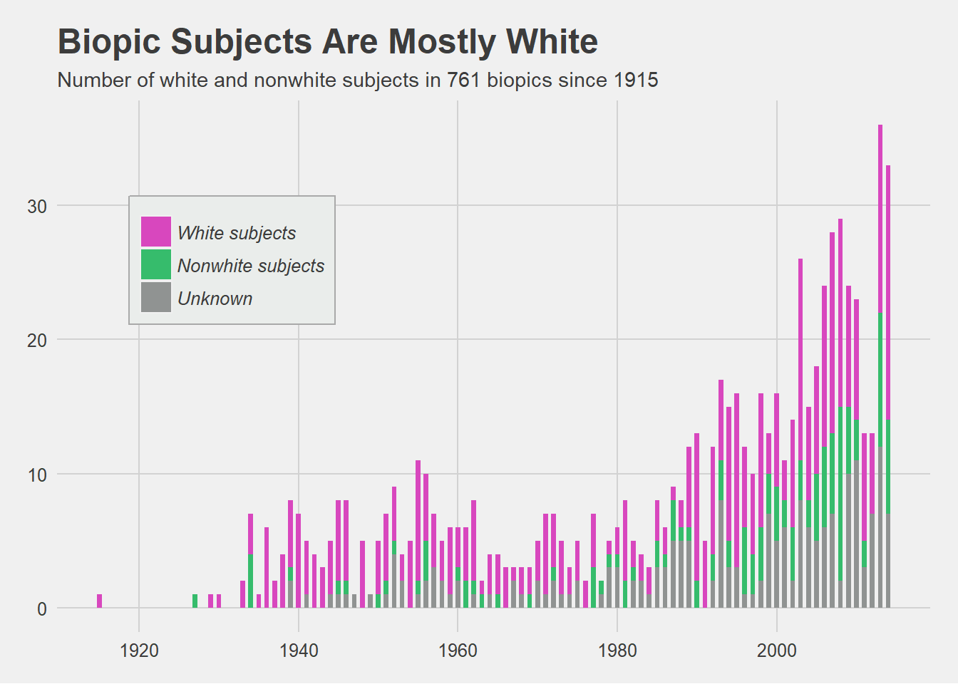
Writing narratives with data: An introduction to ggplot2
I wrote this tutorial and presented it at R Ladies Twin Cities. It uses fivethirtyeight biopics data and begins by recreating their graphics. Feel free to use it and share it!
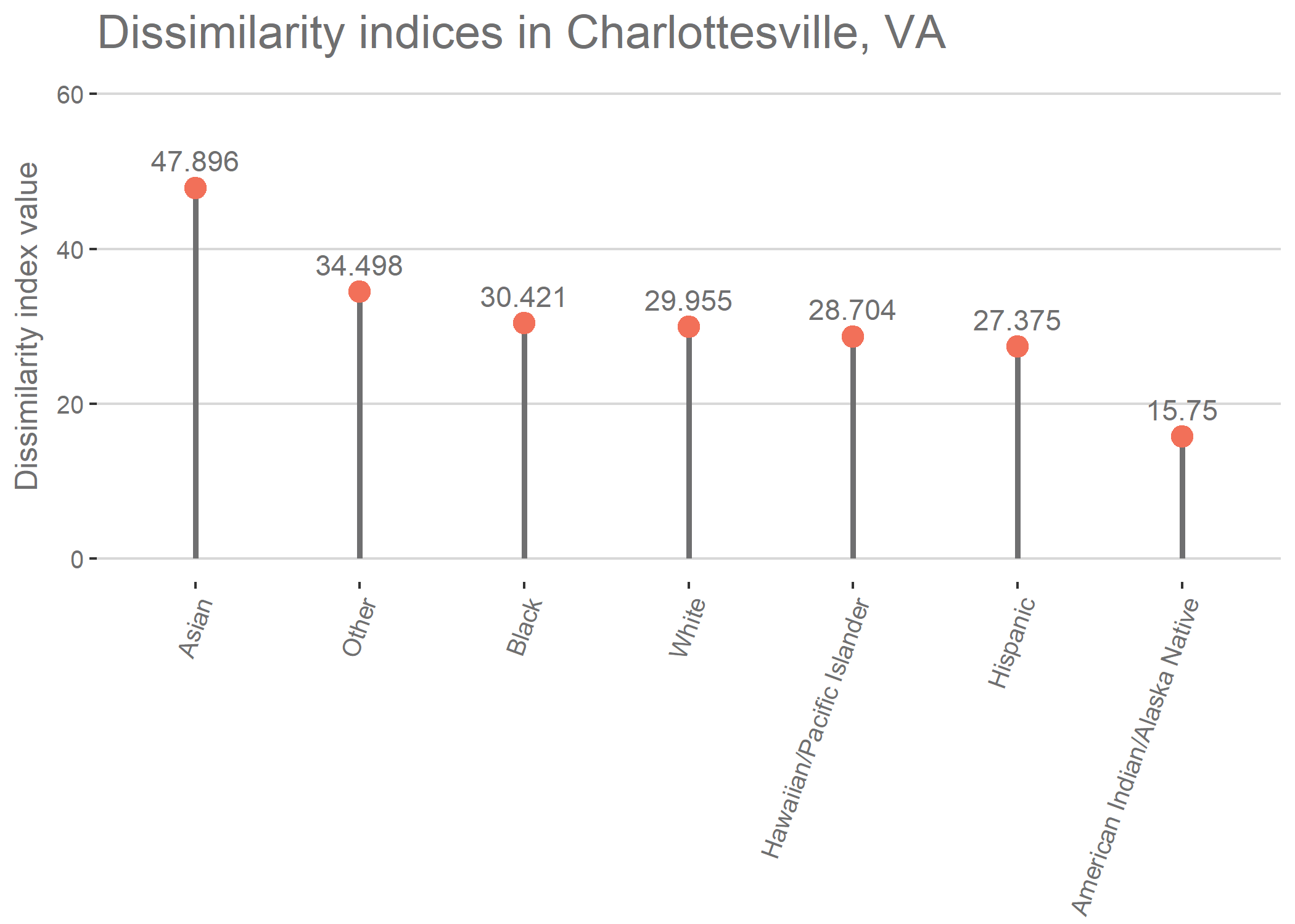
Racial residential segregation in charlottesville, VA
In my Metro Analysis class, we had to pick a city to study during the semester. I chose Charlottesville, so I analyzed residential segregation, the housing market, and the job market in the metro area. For the residential segregated, we used the dissimilarity index. I made a plot showing which racial groups were most and least segregated in the metro area: The rest of the code and data for the project is available on GitHub and maybe at some point I’ll get around to writing more about it!
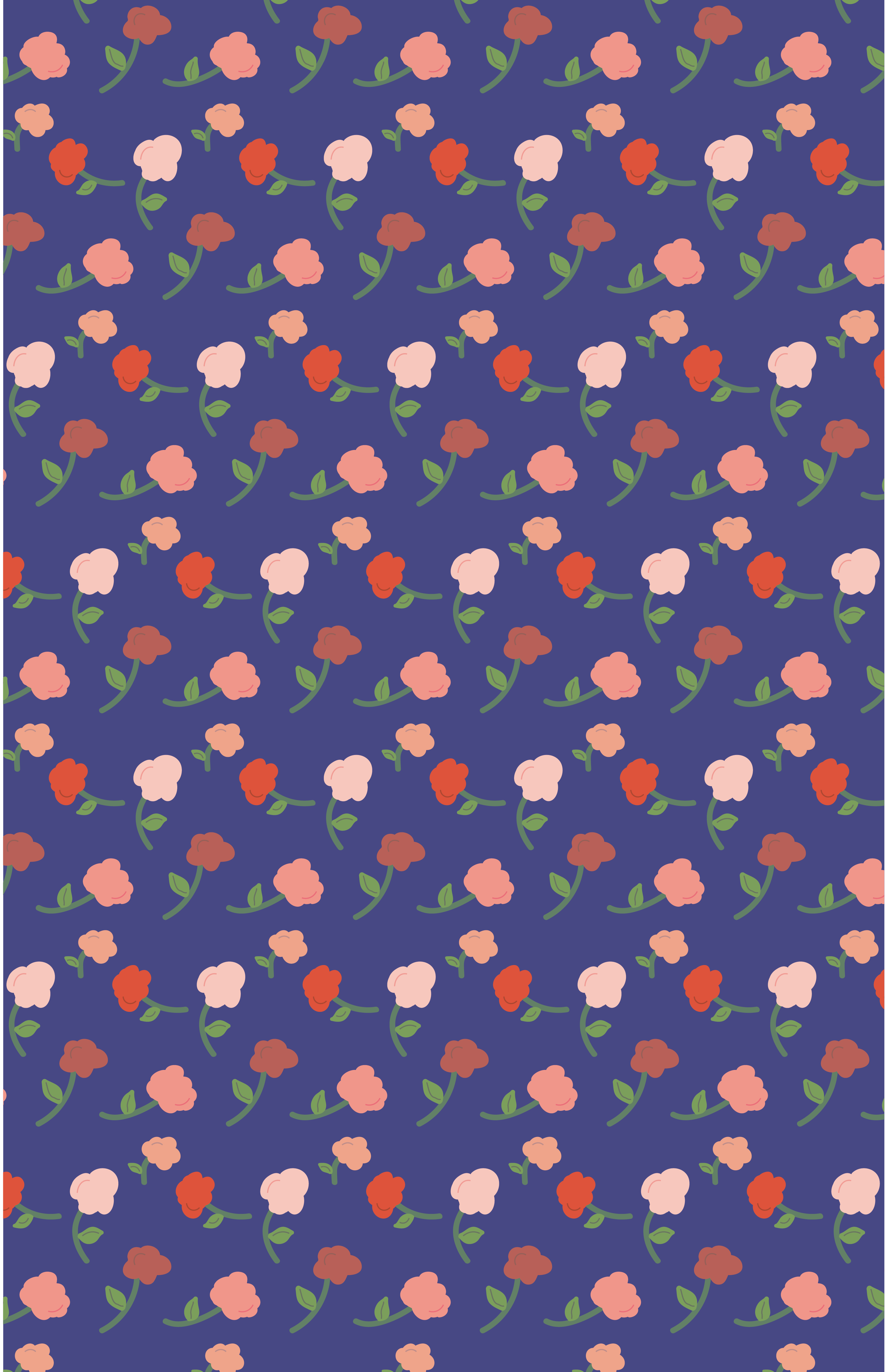
Design: tossed patterns
For my design class, I sketched and digitized a tossed pattern using Adobe Illustrator and Photoshop. I then presented the pattern on two different background colors, each highlighting different elements of the design.